We’re rounding off our 5-part accessibility in design series with motion: how best to approach movement and animation on your website – and what not to do if you want to make sure it passes the WCAG’s AA accessibility testing.
Let's go.
First up, is motion bad for accessibility?
Believe it or not, a video background is actually a lot more accessible than a static image. Why? Because the motion allows users with accessibility needs to clearly differentiate the static content from the moving content – and that, friends, makes it much more legible.
You see this kind of format on common streaming services such as Netflix, Prime Video, Disney+, ITVX and iPlayer. The sites play trailers in the background of the hero – sometimes with shadows and overlays to help the text stand out more. For a refresher on colour contrasts and backgrounds, visit our colour testing post.
How to make your movement and motion accessible
Don’t make your users feel sea sick
On the average website, motion makes up 20% of the user experience. It’s known to increase interactions and sales on some sites, but that doesn’t mean everything should move. Overdoing it can result in really bad drop-offs and just frustrate users – so approach it with caution.
Stick to three flashes or less
Guidance from the WCAG states that anything with motion on a website, whether it be a simple transition, video content or a gif, should never flash more than three times. Not only is it pretty distracting, but too much flashing can be harmful to users with accessibility needs.
Time your motion right
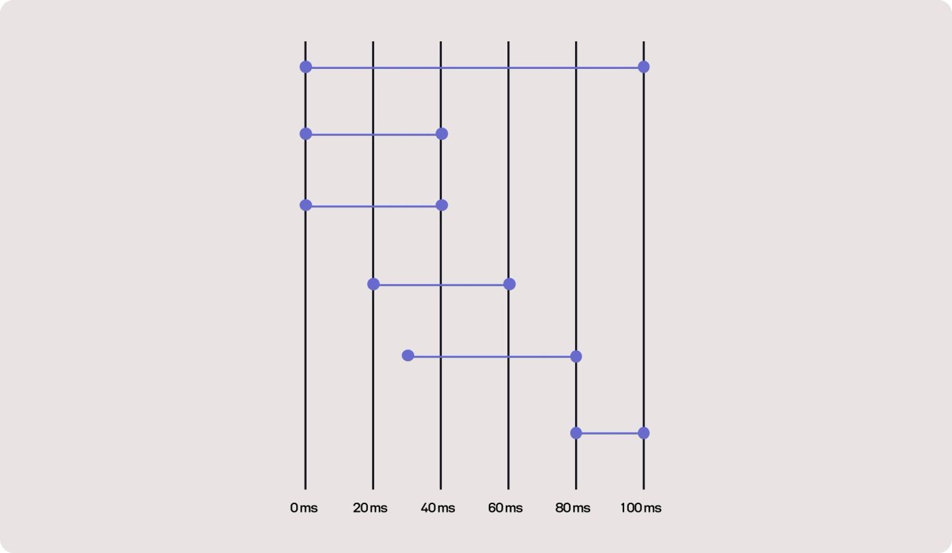
Some accessible users might experience anxiety as well as vision impairments. This is why it’s so important not to bombard your users by causing everything to move at once. Time things intelligently – and don’t trigger anything too crazy at a point where they might be reading some important copy.
And there you have it – our final instalment in our accessibility in design series. Head back to the journal for a recap on everything we’ve covered.


