Accessibility in design - Colour testing

Written by Biel


Accessibility has always been embedded in the agency. But with research showing that the internet may not be as inclusive as we want it to be, our mission will always be to ensure we’re doing everything we can to create exceptional experiences for everyone
In a recent Lunch + Learn, our Design Director, Simon, talked us all through the ins and outs of web accessibility. And in this 5-part journal series, we’ll cover the key elements required to meet the minimum AA web accessibility standards set by the W3C (a community founded by the inventor of the World Wide Web himself, Tim Berners-Lee).
First up – we’re tackling all things colour testing.
As many as 217 million people worldwide have a moderate to severe vision impairment, with this number expected to rise to 588 million by 2050. But we’re not just talking about low vision or colour blindness. We should be designing for dyslexia, autism, anxiety and many more conditions, too.
And this, friends, is why colour testing is so important.
What is colour contrast?
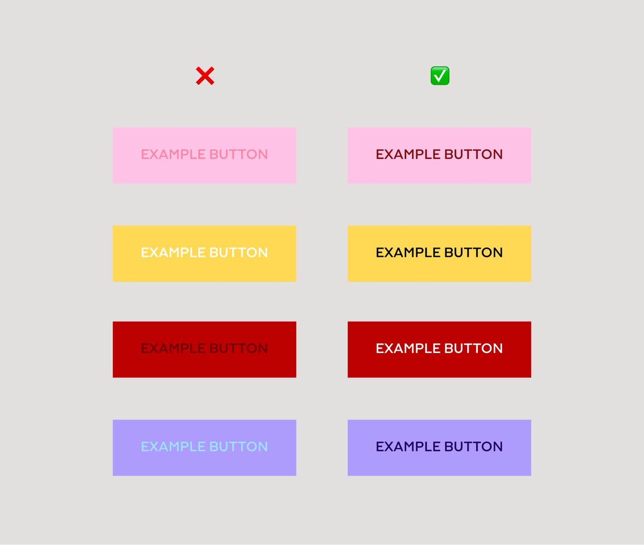
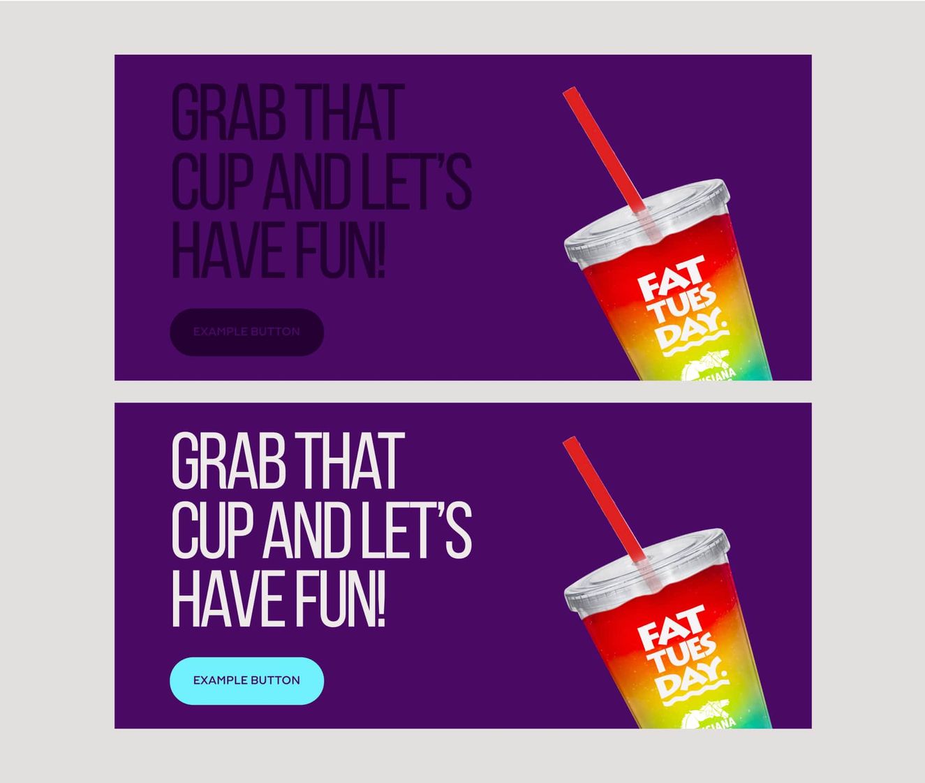
Colour contrast plays a huge part in legibility. It’s the difference in lightness/darkness between a font (or anything in the foreground) and its background.
And when it comes to web accessibility, how well one colour stands out from another colour determines whether or not most people will be able to read the information.
Which elements does a colour contrast apply to?
In UI design, the minimum requirements set by WCAG for colour contrast have to be followed for anything that a user has to read or interact with. And by that, we mean:
Buttons
Primary and secondary CTAs
Controls
Carousel arrows, pagination, filters etc.
Text
Any written content that appears on a website
And which items aren’t as important?
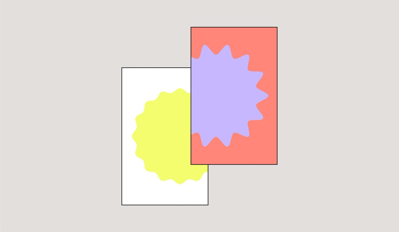
The legal requirements aren’t as strict when it comes to branded elements like graphics or illustrations. If a user doesn’t have to read or interact with them, and they’re more of a brand aesthetic, then meeting the WCAG accessibility standards isn’t critical. But – if we’re talking about elements like infographics, or illustrations that are key to telling a brand’s story, then we’d always recommend following best practice.
Iconography
Icons that represent information
Illustrations
Brand illustrates to signify content
Graphics
Think scribbles, shapes, accents, etc.
Connotations with colours for web accessibility
There’s a psychological impact on colour choices for web accessibility, especially for people with visual impairments.
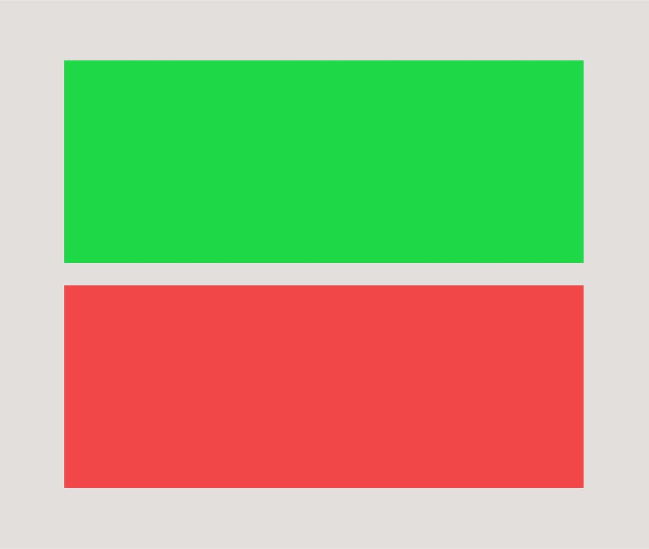
For example, red is psychologically negative, so using this for key user journeys and CTAs may impact how users interact with your website.
Green is seen as positive and progressive, so this may entice your user to click a CTA, or add anxiety if they feel they’re committing to something by clicking this.
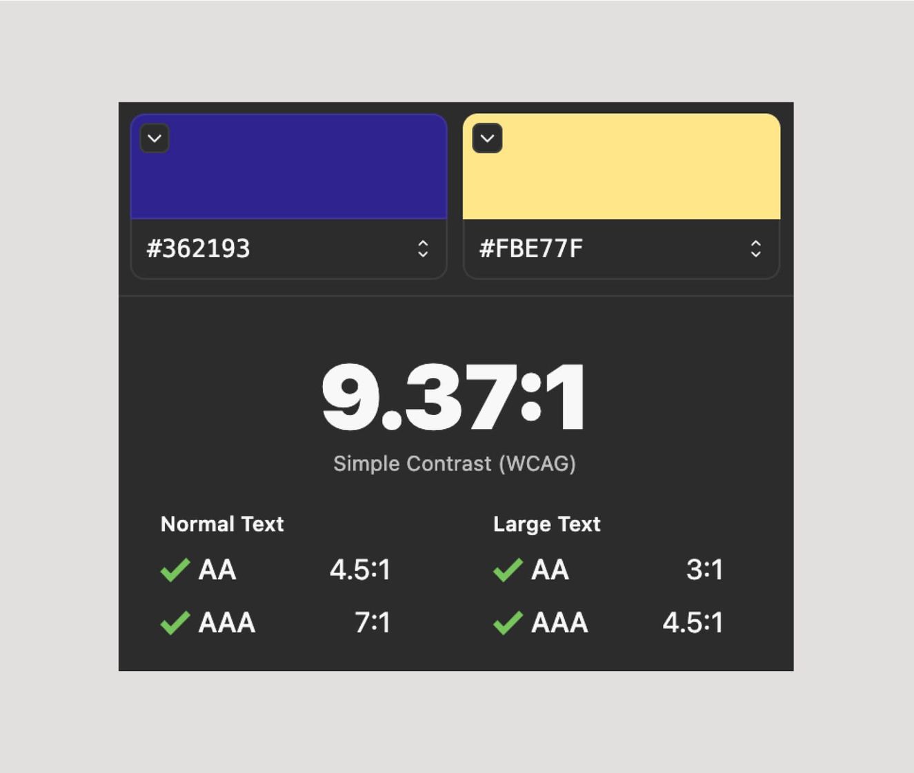
What’s the best way to test colour contrast?
Luckily, the internet’s made it easy for us to test for colour contrast. From Figma plugins to website widgets, here’s our pick of the best tools of the trade:
What’s the AA rules for normal text vs. large text?
In some cases, colour contrast isn’t always so clear cut. Your design may fail the AA’s minimum requirements for normal text, but pass for large text. So while you can’t use the colour combination for body copy, it’s safe to use on headlines.
But – it’s a risky one. So to avoid clients running into any trouble in the future, it’s much easier to go by the rule of: if it doesn’t pass for normal and large, don’t use it. Simple!
And what do we do about backgrounds?
Flat colours
Make sure the text used on top of the background passes the test. Light colours on top of dark are more likely to pass AA testing than colours from the same shade or spectrum.
Gradients
The same colour contrast rule also applies for gradients. However, all colours combined within the gradient have to pass accessible colour contrast with the colour you want to use on top of it.
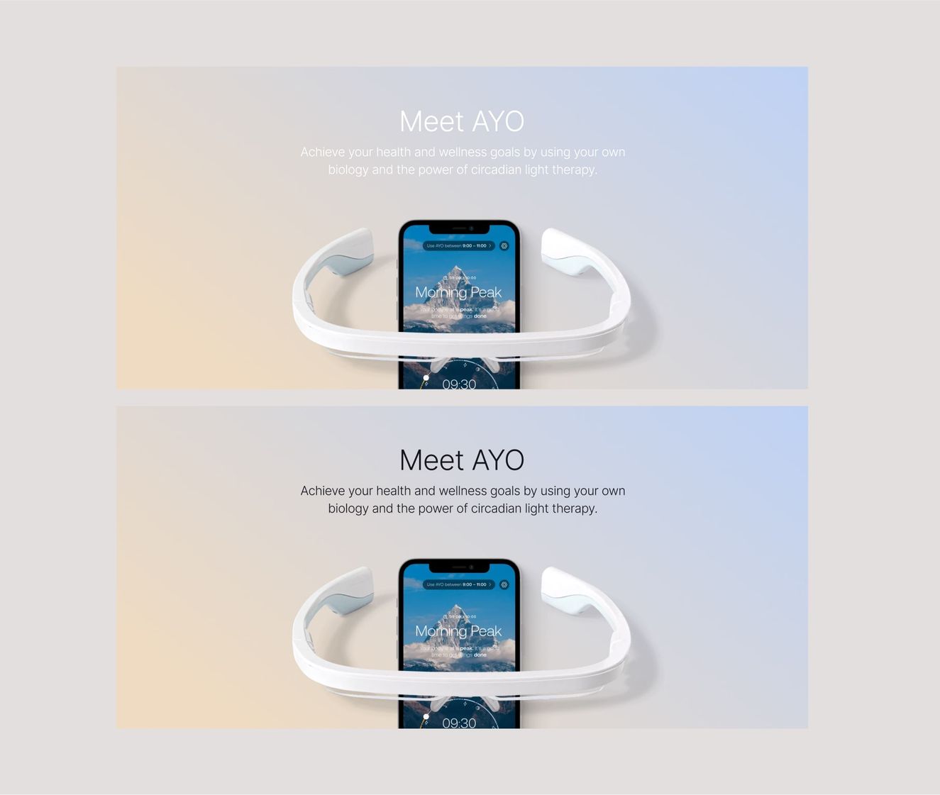
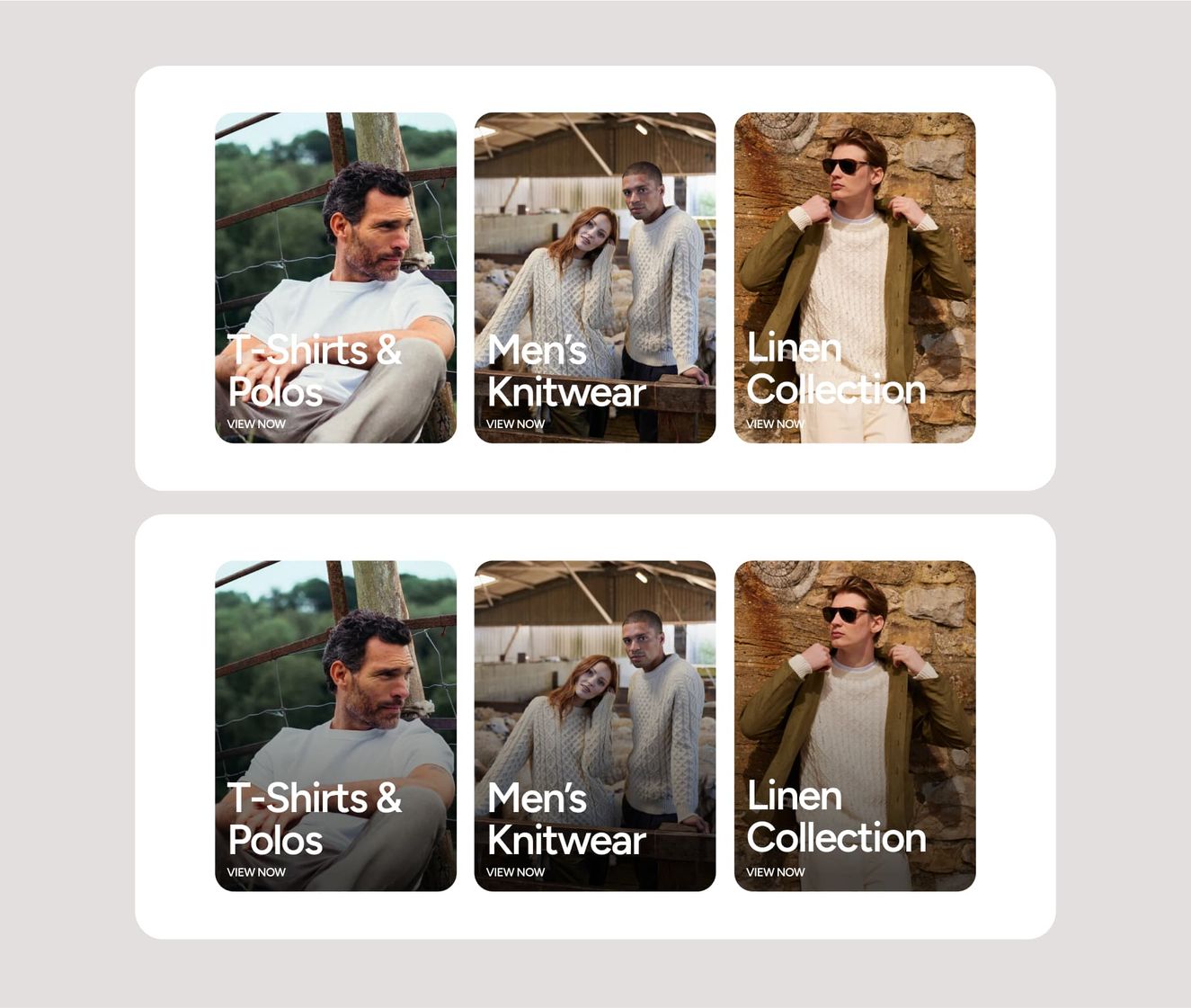
Image tones
In the case of image tones, what works for one image won’t always work for another. Be sure to add shadows or overlays to images that need to have text or interactions applied on top of them to give the right contrast.
It’s worth bearing in mind that images will change once the site is live, so all image type components should be made safe so that no matter what image gets thrown in, it always looks great.
And that’s AA colour testing in a nutshell, people. Tune in for the next instalment: typography and legibility.