Viatu is making ethical travel accessible to everyone. Travellers can discover, personalise and book every aspect of their trip to Africa online with the help of Viatu’s responsible travel experts. And because each Viatu partner is carefully chosen based on their commitment to sustainability, the brand is enabling a future where travel has a positive impact on people and the planet.
- Brand identity
- UX/UI design
- Copywriting
- Front-end development
Up until now, the Viatu team’s main focus had been on developing the business’s bespoke trip booking system. But the time had come to replace the initial placeholder branding with a new visual and verbal identity – one that would elevate the business as it expands and better reflect what it really means to be responsible. Our role was to help create this new brand identity, translate it into an engaging online experience on the front-end, and make sure the entire user journey flowed seamlessly from start to finish.
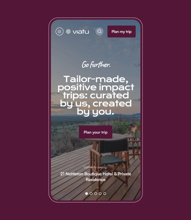
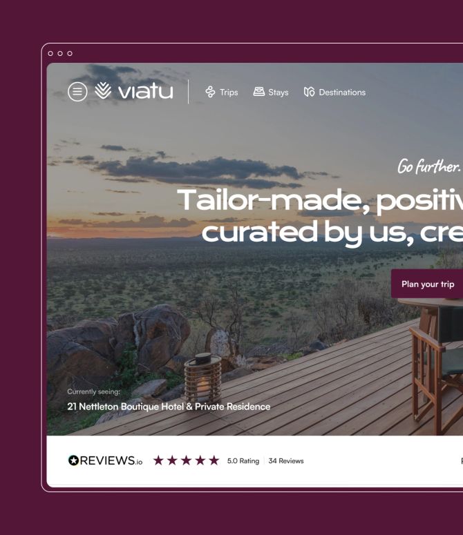
Understanding people, positioning and purpose
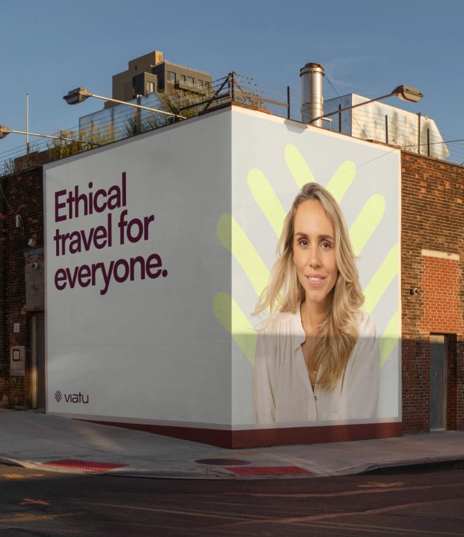
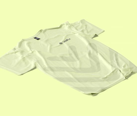
With new trip locations on the horizon, the new brand needed to easily grow with the business. We built a palette inspired by Africa’s wild, untouched landscapes, using colour psychology to make sure our choices aligned with Viatu’s modern and confident character, but still gave a nod to its sustainable roots. We explored traditional hand-drawn tribal patterns and texture, delved deep into photography and iconography styles, and chose typography that reflected Viatu’s bold and playful nature. Then, we rigorously tested everything for legibility and clarity. The result? A brand that translates across all languages and currencies – and can be adapted in line with new product features and Viatu’s future outside of Africa.
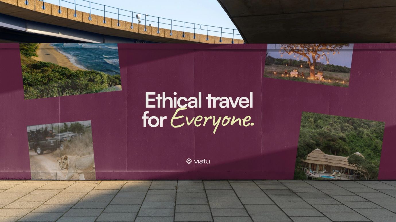
Finding Viatu's voice - and futureproofing it
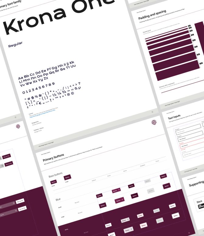
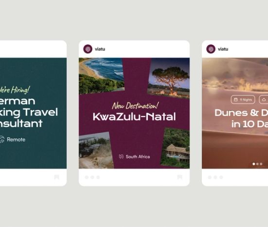
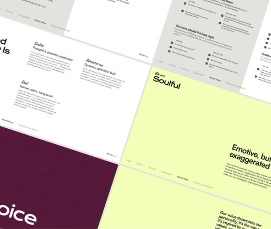
While we took care of branding and web design on the front end, Viatu’s product development team would always be responsible for the trip booking system. To ensure consistency across the entire user journey, we built a comprehensive design style guide that featured everything from brand placement rules to UX styling. We even outlined photography aspect ratios, so all imagery translated perfectly across desktop, mobile and social media.
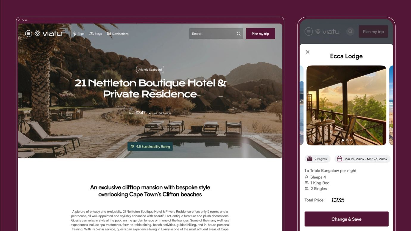
A site that's no longer product first, but user first

