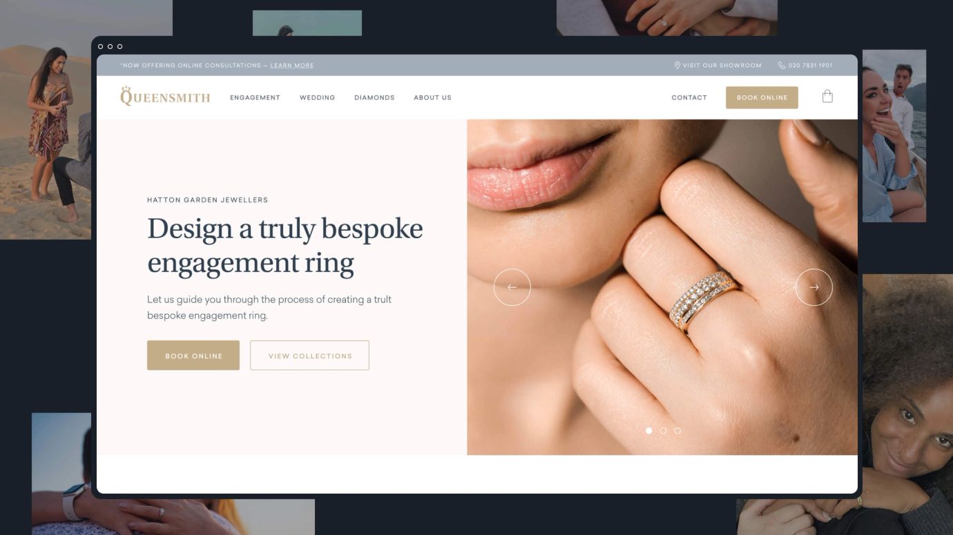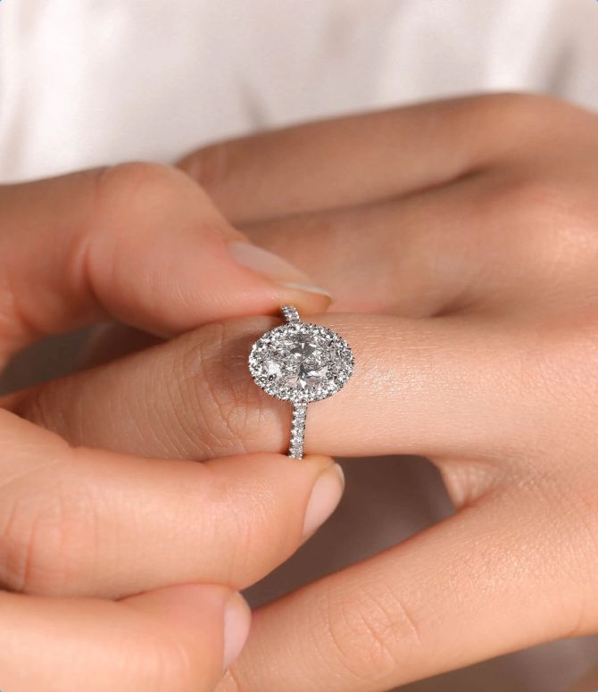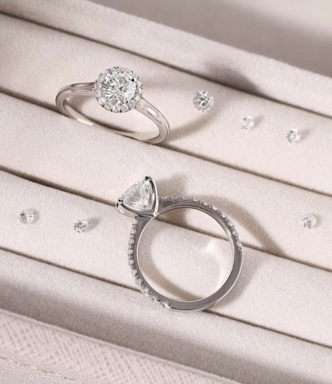
Based in Hatton Garden, Queensmith (and its team of master jewellers) are experts in crafting ready-to-wear and bespoke engagement and wedding rings. Made using only GIA-certified diamonds, Queensmith’s jewellery is crafted in its in-house workshop in the heart of London’s Diamond District.
- UX/UI design
- Front-end development
- Craft Commerce development
When Queensmith first reached out to Series Eight, it was part of the Hearts of London Group, along with its sister brand - Hearts of London. The plan was for both jewellers to merge and operate under the one Queensmith brand, and so a new website couldn’t have come at a better time.
Queensmith’s new website needed to retain the value held in the Hearts of London Group brand. But it also needed to provide a high-end e-commerce experience - something that Queensmith hadn’t offered before, as the current site only enabled users to book a consultation at their Hatton Garden store (where they would then go to finalise their purchase).


Refining and aligning a brand image

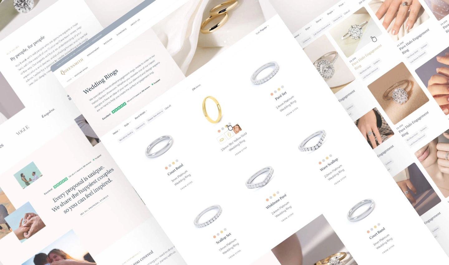
Enabling users to buy ready-to-wear rings online meant offering a huge amount of options. From the metal and diamond shape right down to colour, cut, and clarity - everything could be fully customised before it was added to the basket. This meant applying special logic, creating complex filters, and ensuring order information could be directly submitted via an integration with Claris FileMaker. But it wasn’t just the ring selection process that needed a simple, easy-to-use interface - we also created a bespoke check-out that included options to select delivery, create an account, as well the process payment.
Refining and aligning a brand image
Fully customisable, right down to the check-out
An atomic approach to design
We had our first eCommerce orders come through within the first week of launch, traffic remained stable and our site speed increased massively, to under 1s for even our most content-heavy landing pages. Our SEO agency described it as the smoothest migration they had worked on!
Sam N.
Brand Director
