Jonite is a contemporary engineered stonework manufacturer that’s shaping the future of urban living. The second-generation family business wanted to increase its market share in the US, the Middle East, and Asia—all while staying true to its Singapore roots.
- Brand identity
- UX/UI design
- Front-end development
- Copywriting
- Art direction
- Conceptual photography
Jonite’s new identity and website had to speak to three distinct audiences—architects, urban planners, and interior designers—each with their own needs and priorities. Every item in Jonite’s extensive product catalogue came with its own load ratings, certifications, colour and customisation options. Plus, we had to showcase engineered stone as premium and sustainable; something beautiful as well as functional.
Our redesign had to position Jonite as an innovative design partner—all while still emphasising the brand’s technical expertise. Research from user interviews and site data showed that easy access to CAD files and product samples were just as important as inspiration from real-world case studies. Our solution had to ensure that each audience got exactly what they needed, wherever they encountered the brand.
Letting subtlety take centre stage
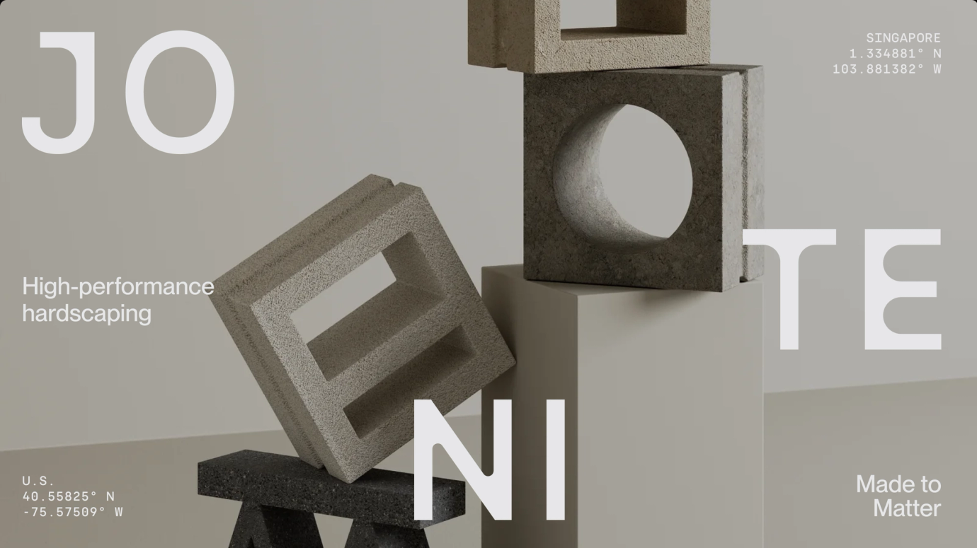
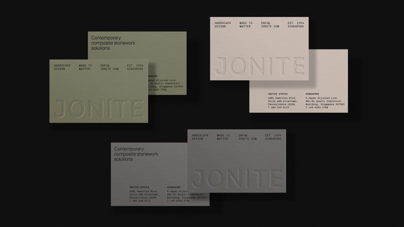
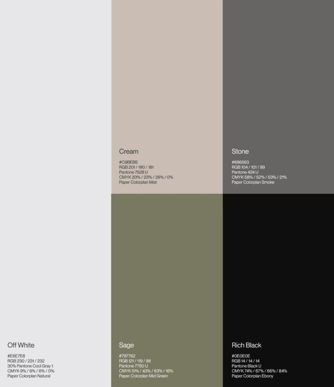
We defined a warm, conversational voice that feels honest and human. Think matter-of-fact, powerful, and peppered with purposeful repetition: form + function, elegance + endurance, and innovation + inspiration. All of this came together under a new tagline: "Made to matter". ‘Made’ as a nod to the nature of composite stonework and bespoke craftsmanship. ‘Matter’ to emphasise the importance of sustainable practices. Because everything Jonite does, from the decisions they make to the products they produce—all of it matters.
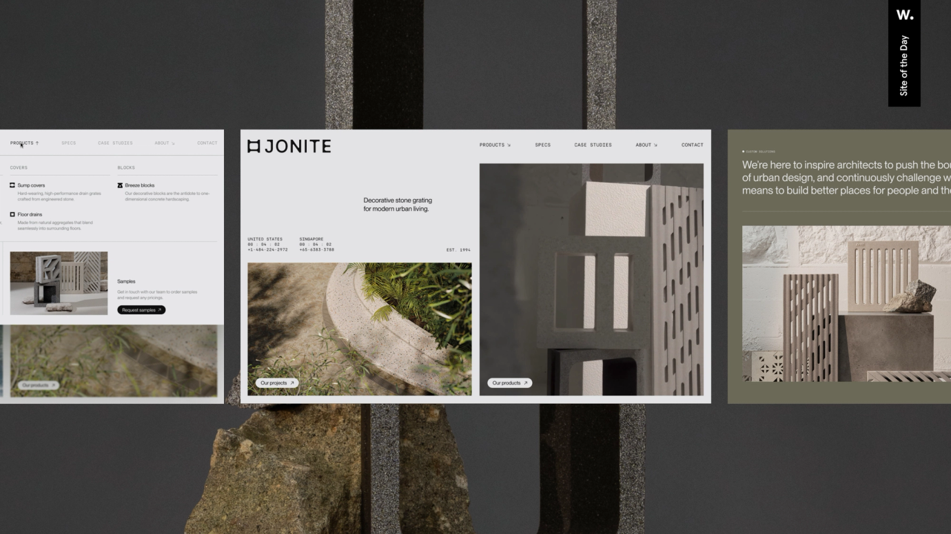
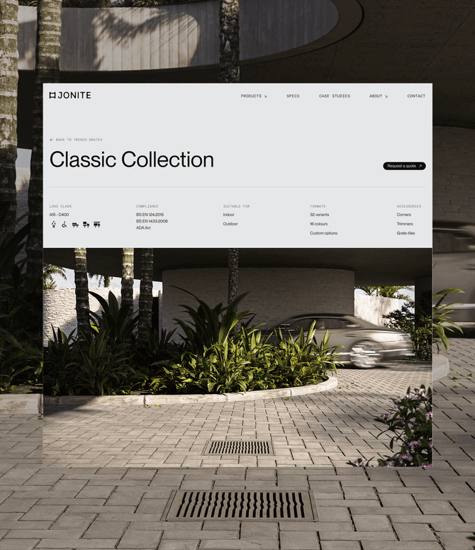
The web design tied together every layer of the brand experience. Modular layouts and rich material textures created an experience that feels like flipping through a high-end architectural magazine—clean and precise, but packed with detail. Typography-driven layouts blended seamlessly with photography, iconography, and 3D elements to create one cohesive space. Plus, easy contact options let users quickly connect with Jonite or local partners when they're ready to move from inspiration to specification.
Purposeful motion, powered by GSAP
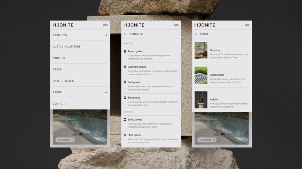
We kept the CMS structure as clean and logical as possible. Complex fields were tucked into separate tabs, whilst we used Craft's custom sources to organise everything systematically—main pages in one section, reusable data like popups and architect profiles in another. For the intricate product hierarchy, we used nested entries down to variants, then switched to a matrix field for the final level. And because each layout was built to scale seamlessly on the front-end, architects working on large monitors could engage with every element, regardless of their screen size.

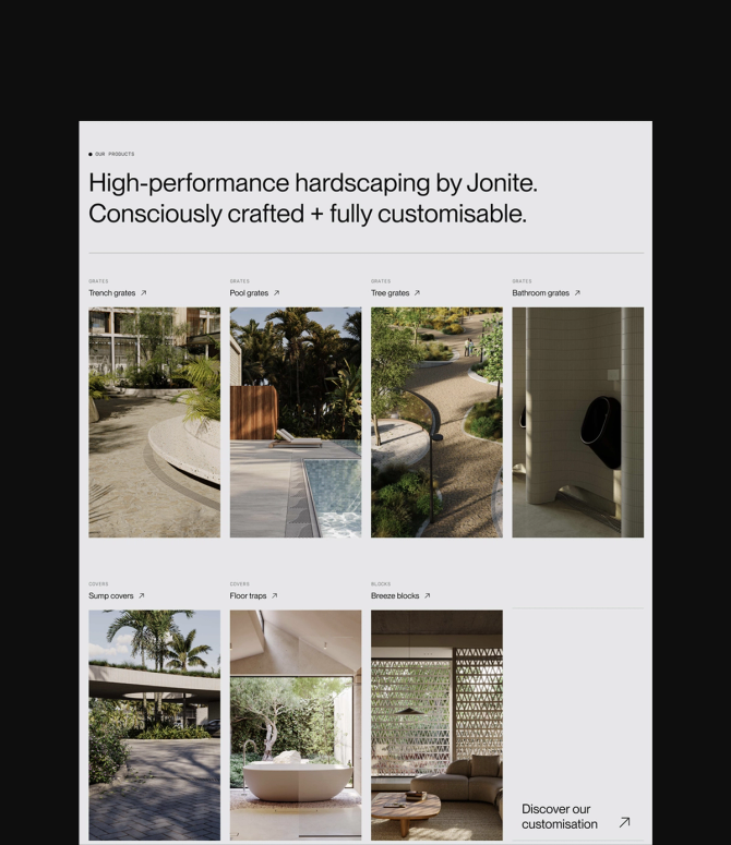
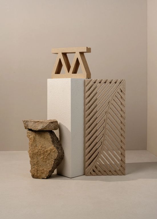
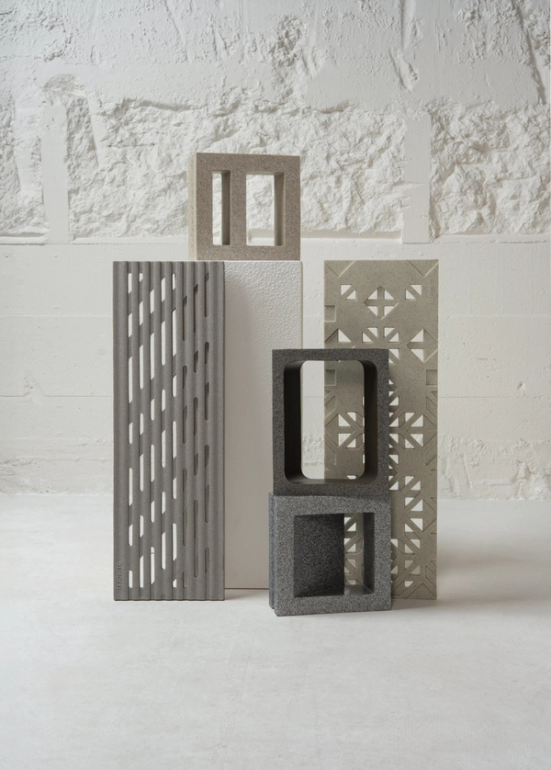
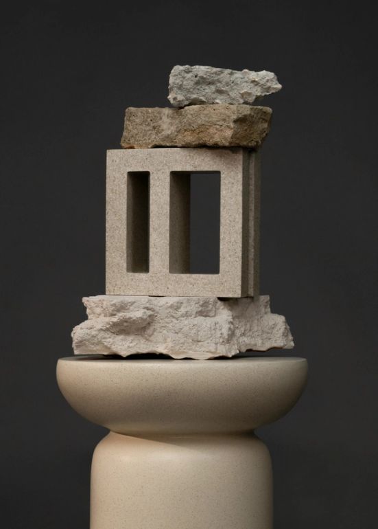
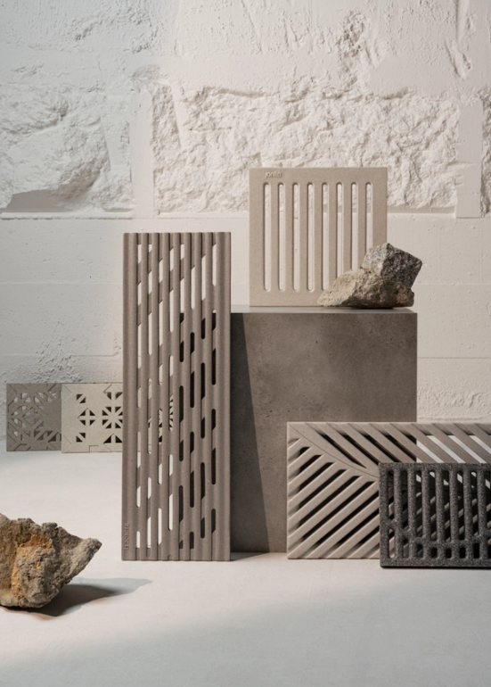
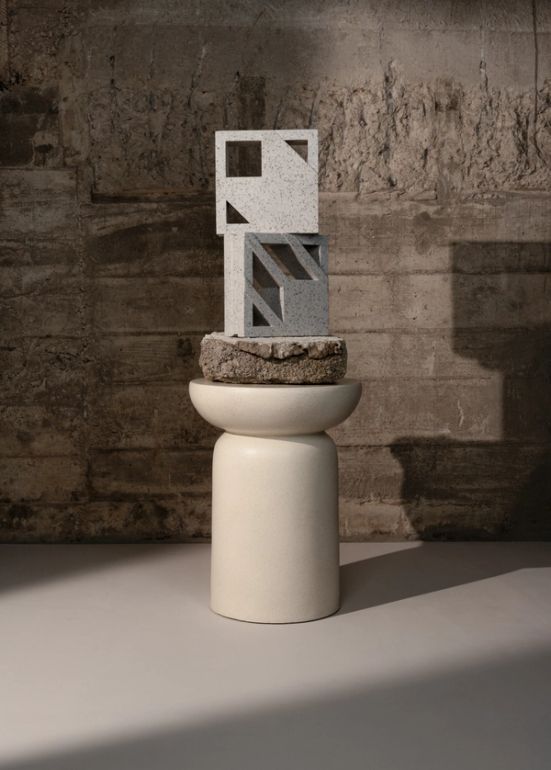
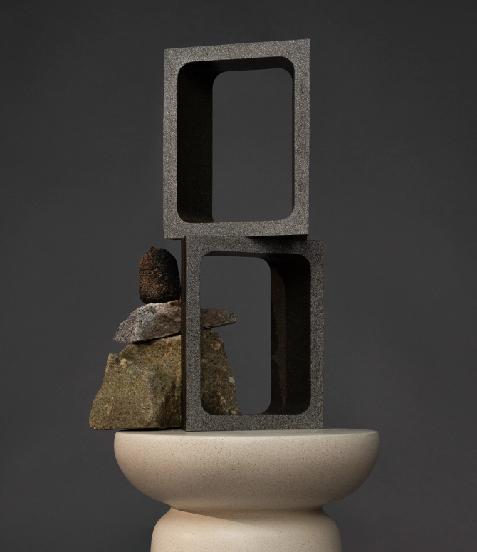
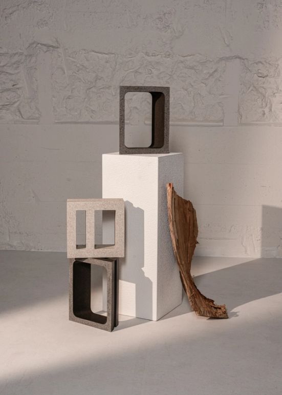
The art direction helped architects and interior designers visualise the full potential of each material. Close-up photography captured every texture and detail, showing exactly how the stone behaved. And to showcase versatility, we placed 3D renders in different settings—from sleek buildings to natural landscapes. Everything centered around authentic, thoughtful compositions, giving users the confidence to make the right decisions for their projects.