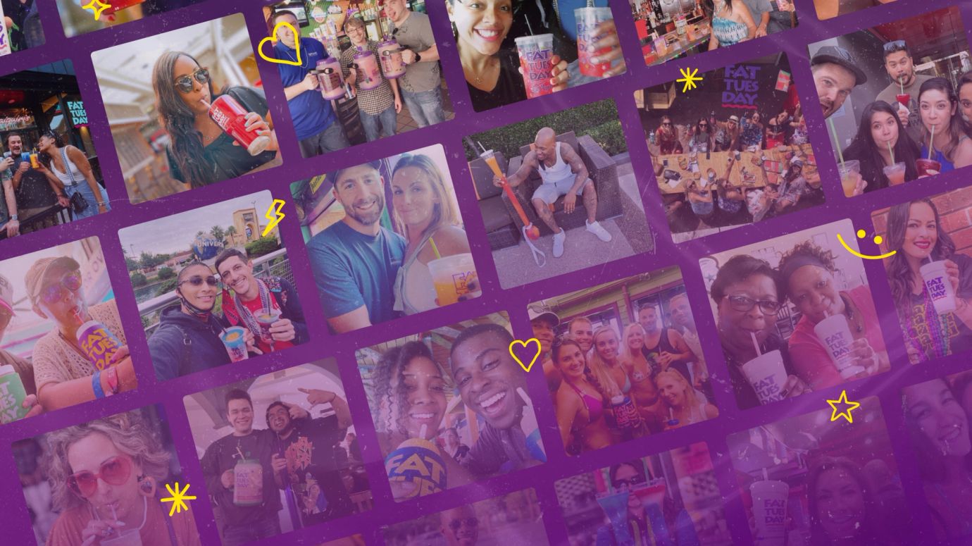
Since 1984, Fat Tuesday has been serving up grab-and-go frozen daiquiris from its stores across the U.S. and beyond. Its signature drinks, souvenir cups, and discounted refills have made Fat Tuesday synonymous with great music, good vibes, and starting the best party in town.
- UX/UI design
- Brand development
- Front-end development
- Craft CMS development
- Copywriting
Come 2021, Fat Tuesday had expanded to over 40 locations. The brand’s digital presence existed, but it lacked strategy. Although its target market of 21-30 year-olds was as engaged (and as loyal) as ever, the brand had outgrown its amateur look of the early ‘00s and the family-owned business vibes. It needed to show it was a strong brand moving in a new direction - and it was heading there fast.
Fat Tuesday’s new website would set the tone for all future marketing initiatives, so the brand needed something to showcase its new identity as soon as possible. A tight timeline, paired with the fact that the new management team were still exploring how to shift the brand from what it used to be to what it needed to be, meant that working collaboratively was a must.
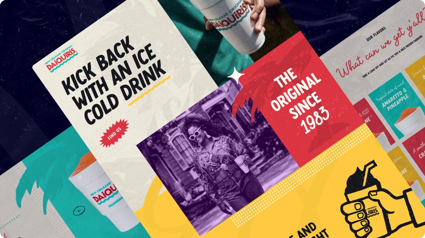
A brand that blends in, instead of just trying to fit in
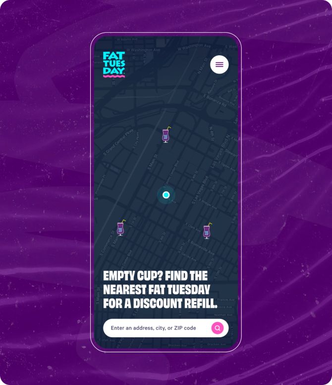
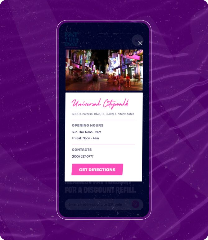
A user journey that keeps the party going
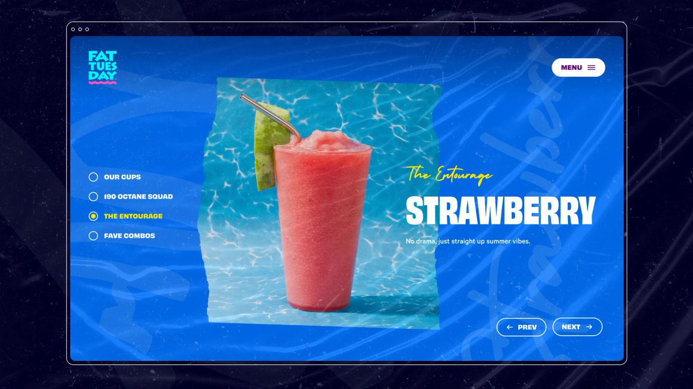
A space for sharing the good times
A local, Louisiana-based little sister
The result was noticeable as we went from 1989 to 2022 with our new sites. Those who knew the before and saw the after were most impressed. Everyone likes the cup on the site and the numbers (visits, traffic) keep increasing - particularly for the larger brand Fat Tuesday. They are very down to earth. No egos. No busy cards. No "we can't do this" attitude. That's what drew me to choose them. You want nice, capable people, who want to work on your project, and most importantly, can get the job done.
Lais M.
Brand Marketing - Fat Tuesday