Since its first store opened in Bethnal Green back in 1996, Eye Emporium has been helping local communities listen up and look sharp. Fashion-forward, committed to clinical excellence, and capable of helping anyone (whether you’re 2 or 82) live life better, Eye Emporium is the independent eye care specialist that’s shaking things up – in the best way.
- UX/UI Design
- Front-end Development
- Shopify Development
Eye Emporium had established a solid reputation on the ground, but its online presence was lagging behind. So, armed with a bold new identity (think striking colours, stand-out messaging, and – of course – a nod to the brand’s heritage) we were tasked with elevating Eye Emporium’s entire online experience. At its core, the website would be an e-commerce store built on Shopify. However, while some products (such as accessories) could be bought online, the site’s primary purpose was to encourage users to book an eye test at their local store. Once the new website was up and running, the team would then also be able to drive more footfall with ad activity.

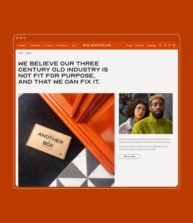
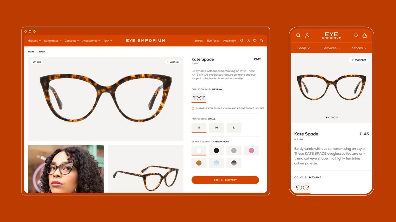
Eye Emporium had recently overhauled its brand identity, with a new look and voice that better reflected its personality and purpose. We took the new guidelines and translated them into an engaging UI, with big, bold, stylised statements, a playful, punchy colour palette, and an Optician Sans typeface inspired by traditional eye test charts. The result? A design that feels refined, revolutionary and – above all – relatable to all.
Eye Emporium’s business is based around its brick-and-mortar stores. And while the site’s main goal was all about increasing footfall, our strategy was to encourage new users to explore products, pricing and purpose-led messaging first – so they’d then be compelled to book an appointment in-store. And for those already searching for an eye or hearing test? We made sure there was a clear pathway to designated store pages with information around opening hours, services and location.


The new brand and website were part of a bigger relaunch strategy. Although Eye Emporium had acquired multiple branches, a lot of these were still operating as if they were independent stores, and that meant inconsistent SKUs, different product lines, and a lack of clarity when it came to mindset and mission. So with the new Shopify site came a new stock management strategy – one that was more consolidated, more centralised, and tapped into a universal range of bestselling eyewear brands as a way to drive traffic.
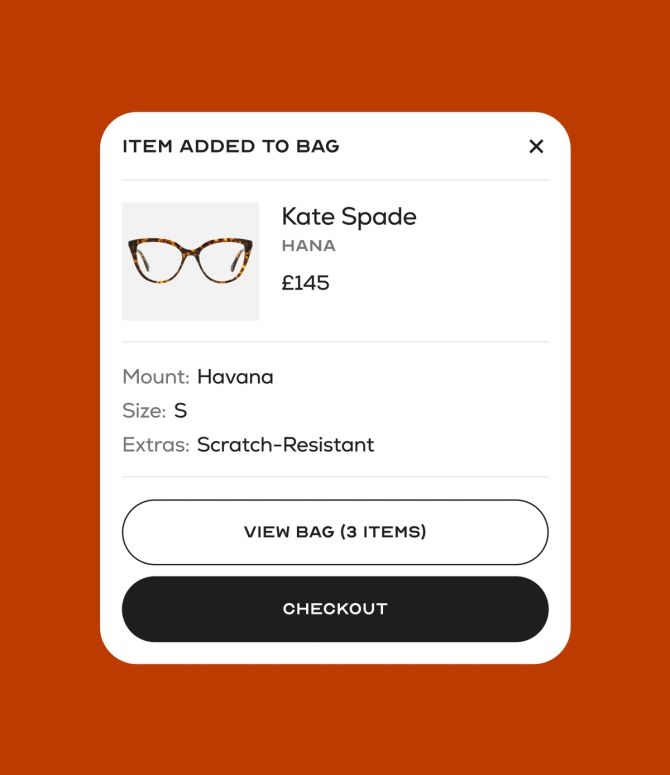
We designed the site in a way that enables users to search for their favourite glasses in nearby locations so they can try on and buy in-person. We made sure this entire shopping experience was just as seamless in the back-end, developing an inventory management process that displays all live availability – without the need for complex product meta fields or third-party app integrations. But the real beauty of this Shopify setup is that it’s e-commerce-ready. As soon as the Eye Emporium team are ready to start selling prescription and non-prescription glasses online, they can. Just a few simple switches in the back-end and it’s good to go.

What an amazing journey with the S8 team! The new website is a total game-changer for an independent opticians brand working in the local community. We now have a platform that celebrates our people and lets our products shine. It’s something we can continuously evolve and optimise, making future marketing campaigns easier than ever. But, most importantly, it’s really brought the long-term vision of our Founder and CEO, Salim, to life.
Emily Johnson
E-commerce and Propositions Lead
