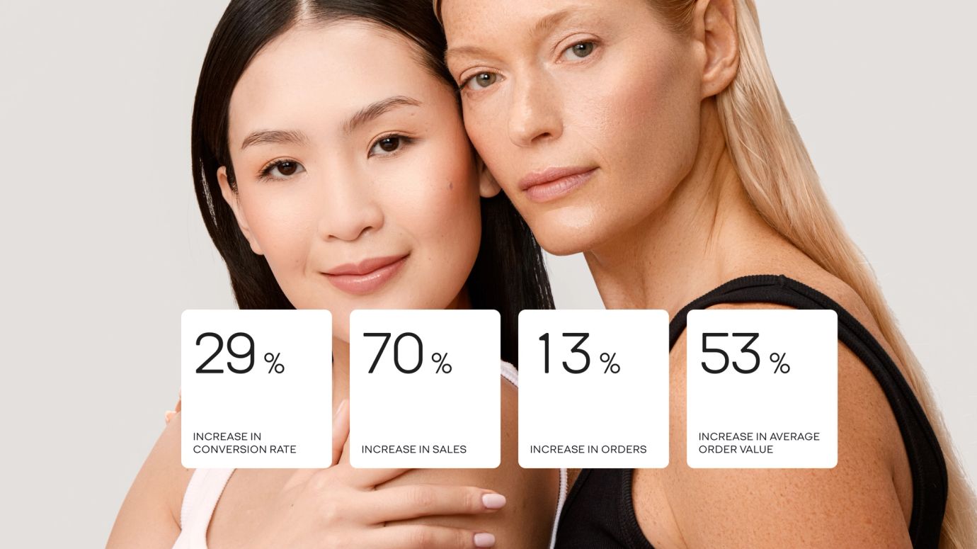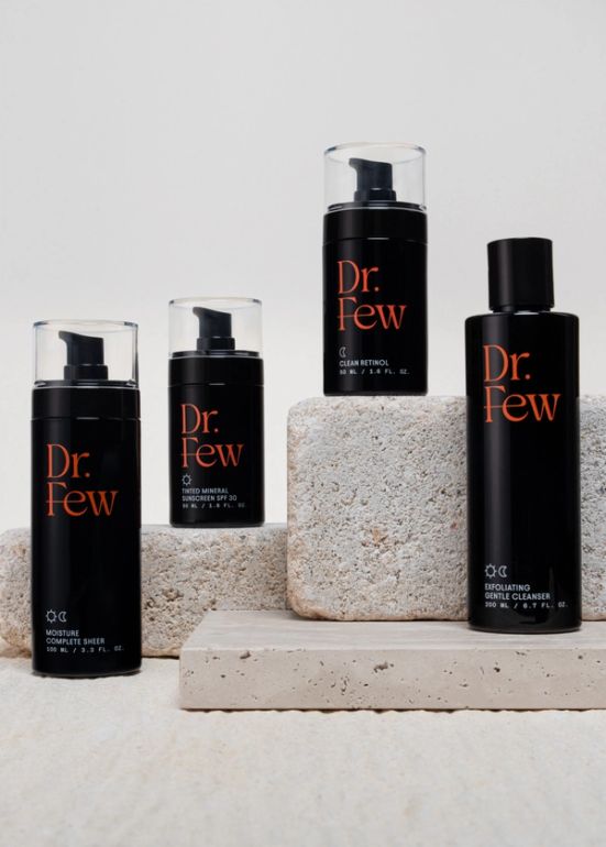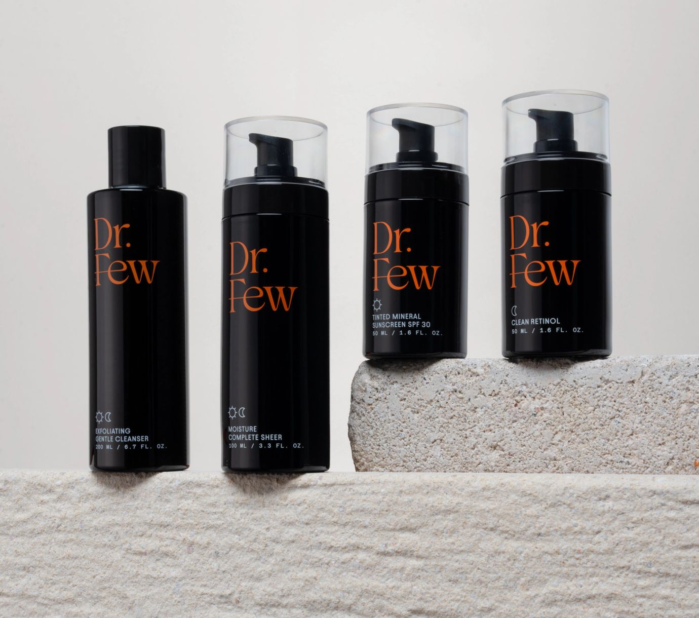
Science-backed skincare made simple. Enter: Dr Few. Founded by Dr Julius Few—the pioneering, non-invasive plastic surgeon and Gwyneth Paltrow’s go-to advisor for all things skincare—this premium skincare brand is renowned for its clean, clinically tested formulas that are designed for everyday life, and every skin type.
- UX/UI design
- Front-end development
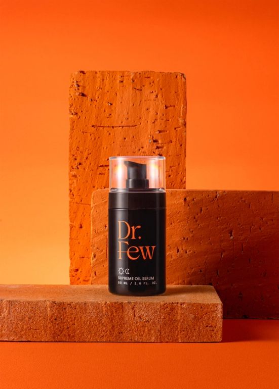
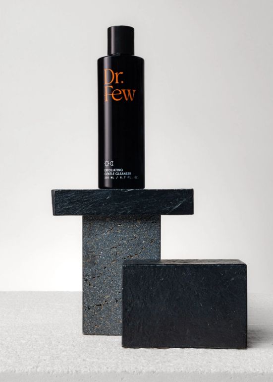
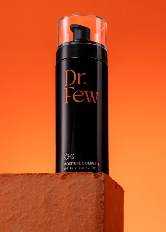
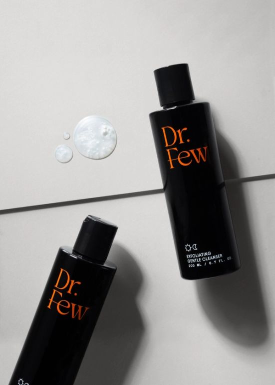
- E-commerce photography
- Email marketing
The brand’s revolutionary Stackable Treatments™ method and reputation for delivering real results had already made it a fan favourite in major retailers like Goop and Neiman Marcus. But Dr Few wanted to level up its direct-to-consumer channels, so tasked us with elevating its Shopify store and other digital assets. The goal? Give the brand a more premium look and feel, increase conversions, and drive customer loyalty.
A Shopify reskin for a revolutionary skincare brand
Alongside all the website updates, we brought in a brand-new email strategy. Our goal was to create an experience that went beyond the website—using detailed storytelling to drive brand awareness, increase average order value and, ultimately, encourage more repeat purchases. To make this happen, we designed and built an engaging welcome flow, set up abandoned cart notifications, and rolled out a new post-purchase journey. And to make sure everything was optimised across every touchpoint, we got to work on an in-depth a/b testing strategy, too.
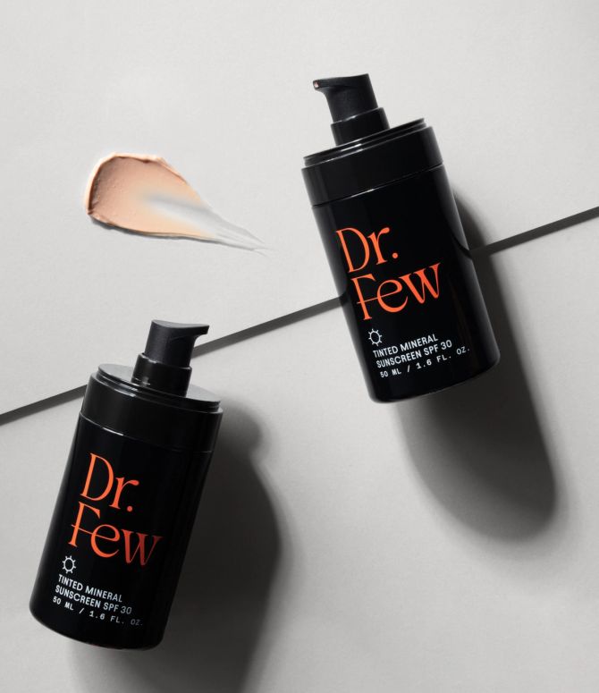
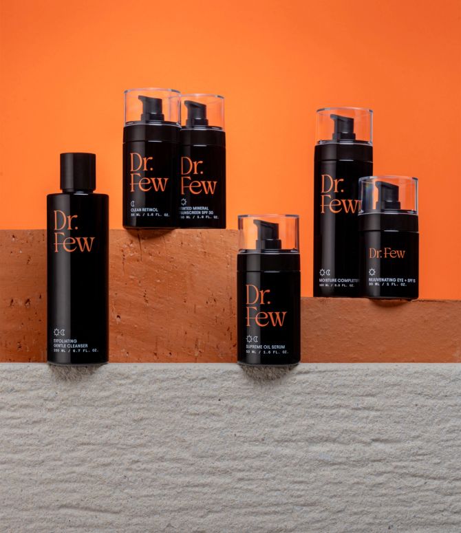
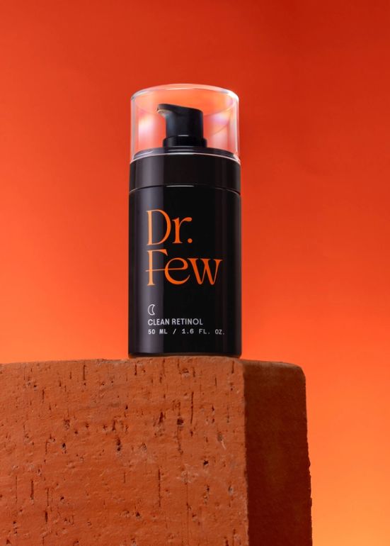
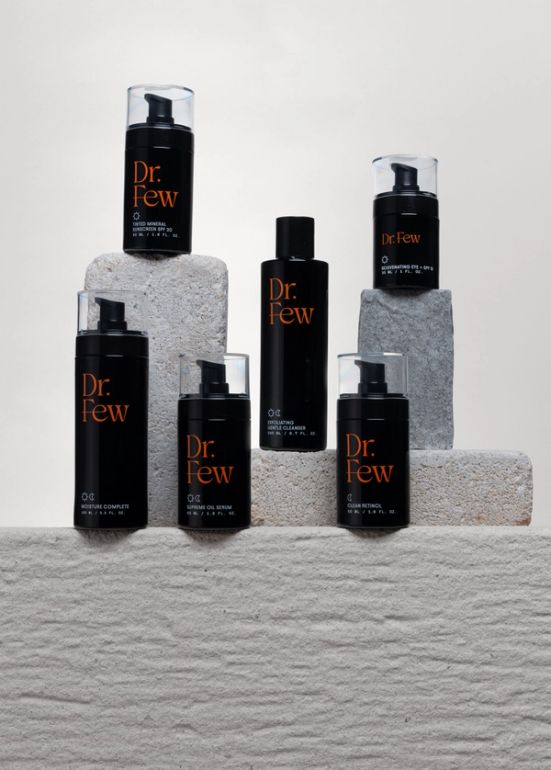
Elevating the entire brand—with brand-new visual assets
