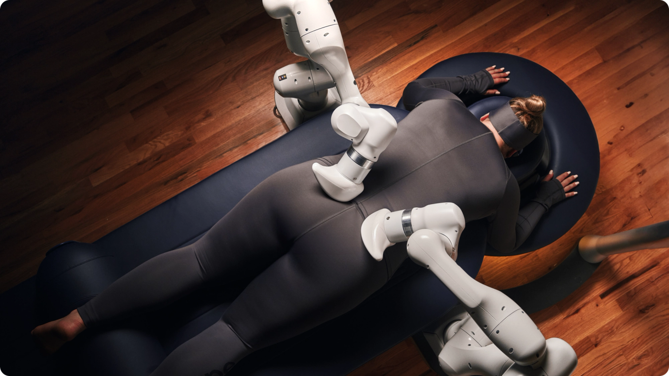
Aescape is a first-of-its-kind lifestyle robotics company that’s redefining the future of self-care. Consistent, accessible, and always on your terms, Aescape’s fully automated massage helps wellness, hospitality, and fitness businesses meet rising demand, empowers therapists, and delivers an exceptional massage experience to every body, every time.
- UX/UI design
- Front-end development
- Craft CMS development
As an emerging startup, Aescape was still operating in stealth mode. Fresh off the back of a rebrand, there was minimal public-facing content showing or talking about the Aescape experience. As part of a robust marketing rollout, the Aescape team wanted to elevate the brand’s digital presence with a new website—one that would engage future members, attract partners, and entice investors.
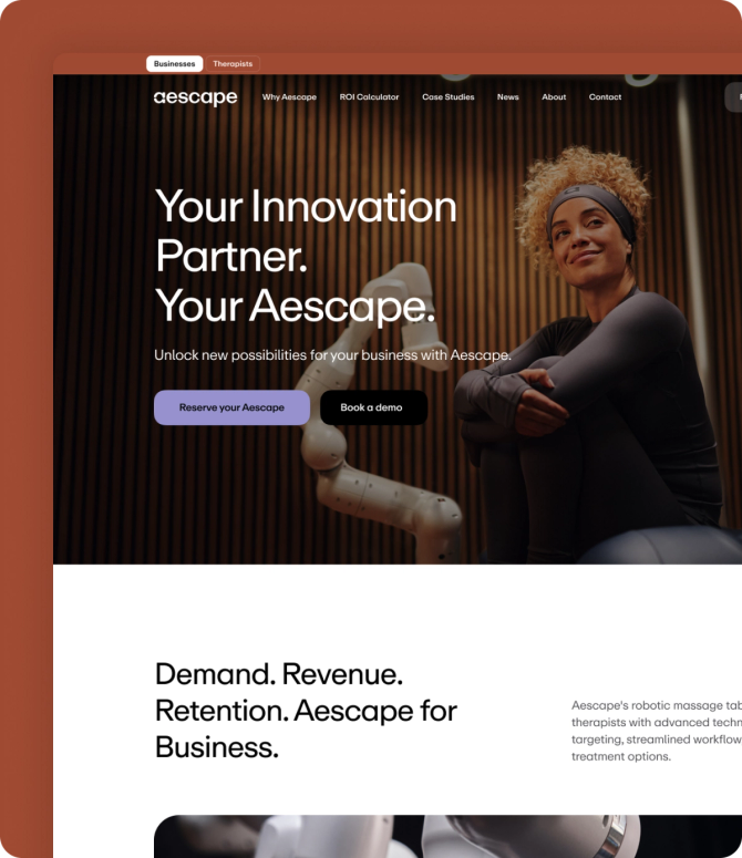
Aescape was a brand-new wellness concept. This meant there was little to no awareness of the Aescape product—or robotic massage as a whole. Our goal was to position robot technologies not as cold and intimidating, but as warm, inviting, and transformative. The Aescape website also needed to match the innovation of its product, as well as engage a number of key audiences: members, partners, investors, and therapists.

A story-centric site design
We collaborated closely with Aescape on everything from custom icon creation to art direction. The goal was to create a deeper, more emotional connection with the user by illustrating how Aescape makes you feel: refreshed and rejuvenated. Throughout the site, we used compelling video and photography to show Aescape in action, maintaining an ultra-clean look and feel—and keeping text to a minimum.


An experience made to move you

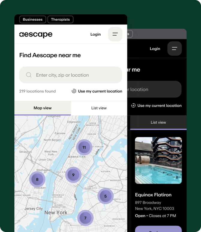
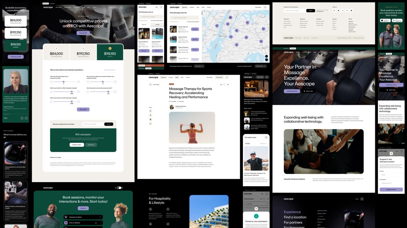
Each section of the site was tailored to communicate Aescape's benefits to every audience. We explored the best approach in terms of colour, structure and content, and mapped out the ideal architecture for each persona. From intuitive Aescape location searches to an interactive ROI calculator, every user journey was designed to be as frictionless as possible. Plus, we integrated multiple newsletter lists, contact forms, and the Aescape booking app to ensure the site was fully optimised for all business goals.
"In our quest for a website that embodies the modernity, premium quality, and uniqueness of our product, Series Eight exceeded our expectations. The response from our team, partners, and stakeholders alike has been nothing short of inspiring."
Becca Valle
VP Marketing, Aescape