5 Web design mistakes killing your conversions

Written by Biel


Your website design isn't just about a pretty interface—it's a crucial conversion driver, and common mistakes within it can silently sabotage your sales and growth. Let's dive into how to fix them.
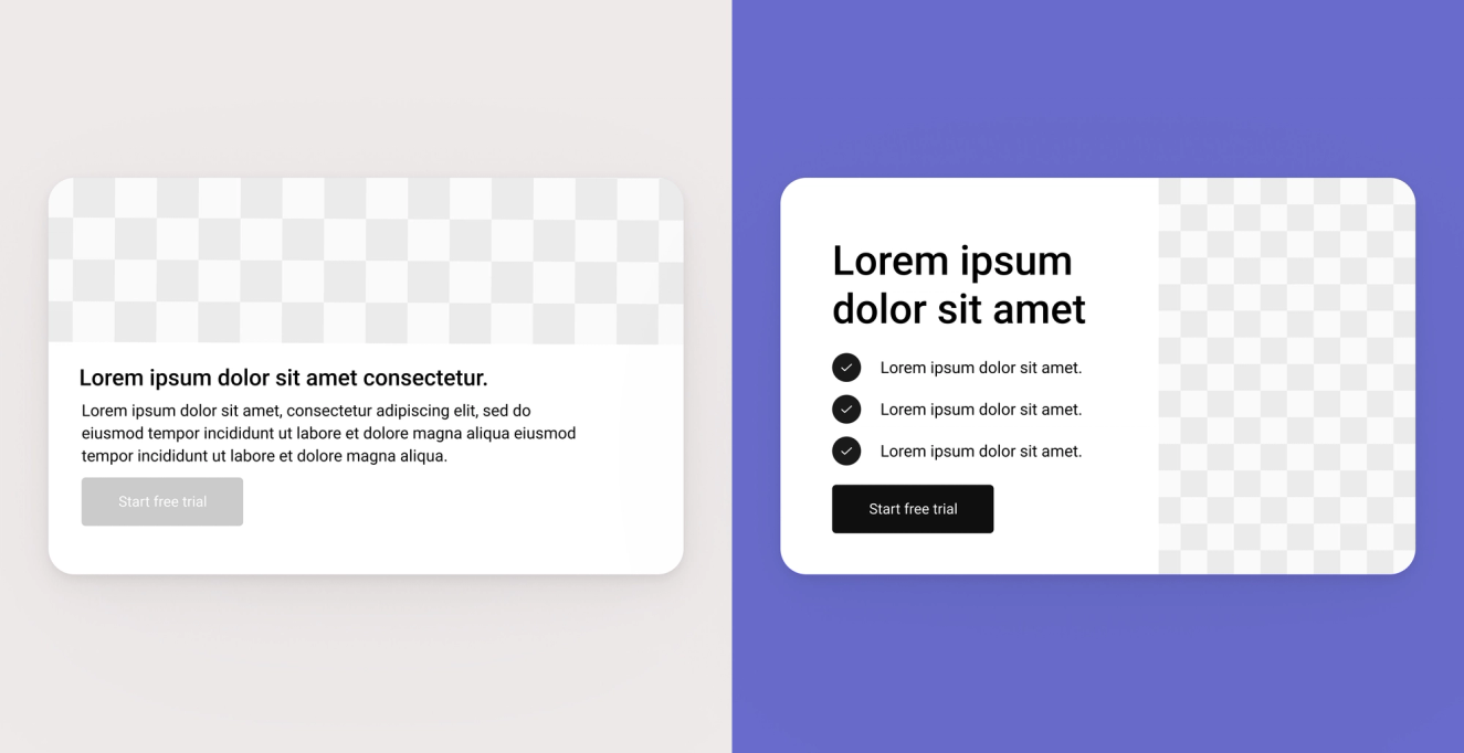
Mistake #1: No clear hierarchy on the homepage
What it looks like: The homepage feels noisy - every block is fighting for attention. There’s no clear structure, resulting in users not knowing where to focus.
Why it hurts conversions: If the message isn’t clear in the first 5-8 seconds, people leave. In fact, visitors can form a first impression in as little as 0.05 seconds (50 milliseconds!).
Fix: Use a clear visual hierarchy by sizing your headline 2-3x larger than body text, limit each section to one key message, and group related elements with consistent padding to naturally lead users from intro to CTA.
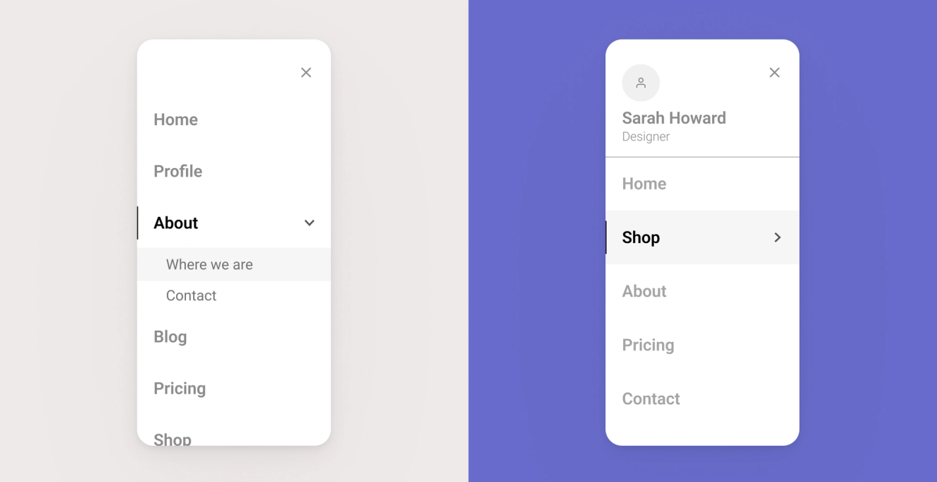
Mistake #2: Confusing navigation
What it looks like: Some menus have too many items, unclear labels, or they hide important pages in dropdowns or way down the list.
Why it hurts conversions: People get lost or frustrated and leave before they even find what they’re looking for.
Fix: Limit your primary navigation to 5-7 clear items, use familiar terms your audience expects (like “Pricing” or “Contact”), and check your analytics and heatmaps to understand what users are actually clicking..
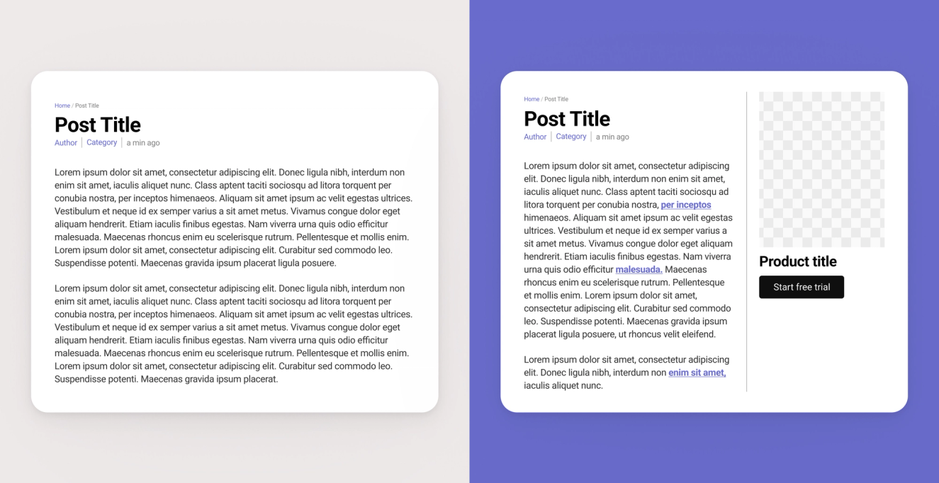
Mistake #3: Weak or missing CTAs
What it looks like: CTAs like “Learn more” don’t say much. Sometimes they’re positioned too low on the page or missing completely in key places.
Why it hurts conversions: If you don’t tell users what to do next — clearly and confidently — most of them won’t do anything.
Fix: Use clear, specific copy like “Get your free demo” or “Sign up for 20% off”. Make the CTA stand out visually and test different positions depending on the device or page.
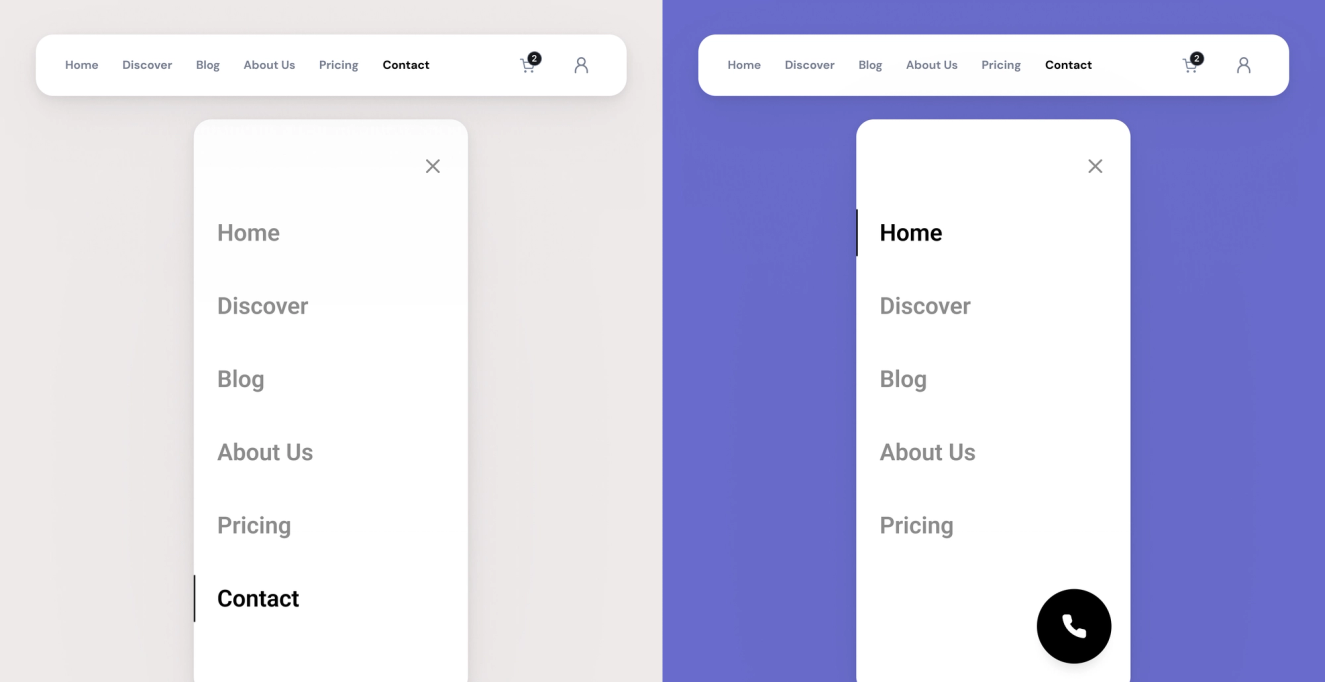
Mistake #4: Poor mobile experience
What it looks like: The site looks good on desktop, but it breaks on mobile. Text is too small, images go off-screen, and buttons are hard to tap…
Why it hurts conversions: Most users are on mobile. If it doesn’t work well, they’ll leave instantly.
Fix: Design with mobile in mind from the start. Make sure layouts adapt well, buttons are easy to tap, and things load fast. Also, test it on real devices, not just Figma previews.
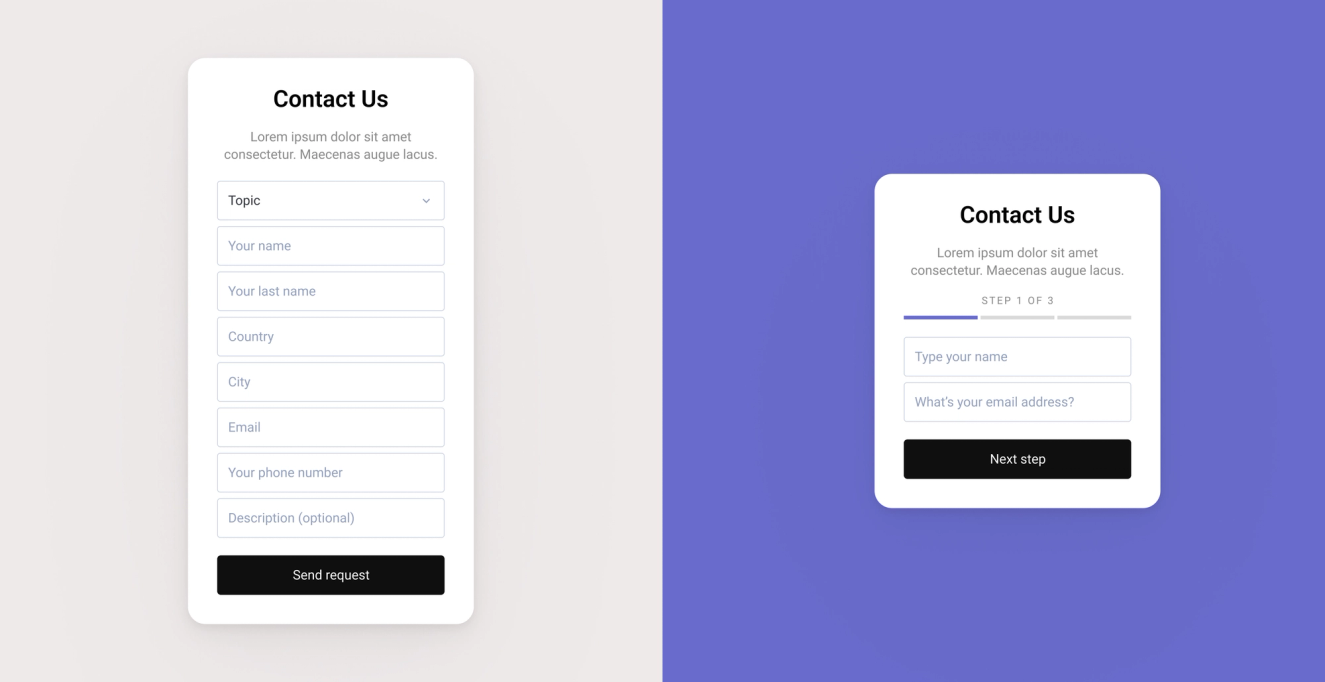
Mistake #5: Overwhelming Forms
What it looks like: Some forms ask for way too much info. Everything is in one long list with no help or structure. It feels heavy.
Why it hurts conversions: People drop off when forms look complicated. Especially on mobile, they just give up before even starting.
Fix: Start by removing any fields you don’t absolutely need for the first interaction, group related fields visually, and use tools like Typeform or multi-step forms to break longer processes into bite-sized, low-friction steps that feel easier to complete.
Ready to elevate your website design and boost conversions?