UI design tips: a thread

Written by S8 Team


In the design world, it feels like UX gets talked about a lot in terms of rules and best practices. But UI, not so much. So when we recently got to talking about our top UI design tips, we couldn’t not share.
It all started with one simple question:

What are your favourite UI design tips? Answers on a Slack thread, please.
On the topic of…
Backgrounds

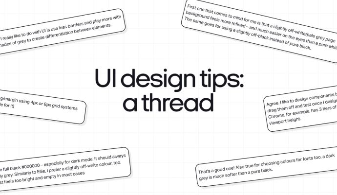
First one that comes to mind for me is that a slightly off-white/pale grey page background feels more refined – and much easier on the eyes than a pure white. The same goes for using a slightly off-black instead of pure black.
That's a good one! Also true for choosing colours for fonts too, a dark grey is much softer than a pure black.

Never use full black #000000 – especially for dark mode. It should always be slightly grey. Similarly to Ellie, I prefer a slightly off-white colour, too. White just feels too bright and empty in most cases
Borders

Something I really like to do with UI is use less borders and play more with different shades of grey to create differentiation between elements.
Shadows
Another one I recently learned was having transparent product backgrounds on a plain fill looks really minimal and clean 🙌
Oh shadows is a good one too. People using mad dark/heavy shadows is a proper gripe of mine. SUBTLE shadows are the way to go 😮💨
I’ll always reduce shadow spread where possible and increase blur and positioning. It leads to better, more subtle shadows.
Sizing and spacing
Use consistent spacing/padding/margin using 4px or 8px grid systems (Variables in Figma are incredible for it)

In terms of UI elements, I always design things slightly smaller than I like. On the design file, the canvas is infinite and whitespace looks cool, but often the screen is crowded with navbars, URL fields, bookmarks etc, which can end up with a really long scroll, or layouts not being fully visible on the screen.
That’s the main reason why I always consider 810px height on an artboard instead of 1024 when doing 1440px width.
Agree. I like to design components based on a viewport size. I usually drag them off and test once I design to see how they fit on browsers. Chrome, for example, has 3 tiers of navigation rows and really shrinks the viewport height.
Also to add to this, when designing any form of input on mobile, always demonstrate what it looks like with the keyboard overlayed, like a real mobile experience.
I always go for 1440 x 960px because it's 3:2 ratio which is a majority of screens, but again hard to design when every browser presents different viewport heights 🫠
Always checking your design in Figma mirror on mobile is a great one too for testing font sizes and padding on mobile.
Stay tuned for more answers on a Slack thread, from talking points to top tips from the team.