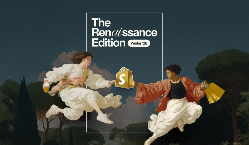
Brands are raging against the AI machine by going bigger, bolder and more original than ever. And we’re here for it.
But how do you take those rich, beautiful brand guidelines in all their glory and translate them into something that sells? Here are our top tips for creating high-performing e-commerce sites that still pack a punch on the personality front.
Balance out the fun with functional
With your product and collection pages, it’s all about being clever with creativity. Be smart with SEO—covering off keywords in your H1s, intros, product titles and FAQs—then see where your imagination takes you. But remember, you’re creating a seamless, e-commerce story, not a whacky, fully-gamified experience. It doesn’t matter how fun and quirky you are, users don’t forgive frustrating web experiences. They’re there to shop—so help them do just that.
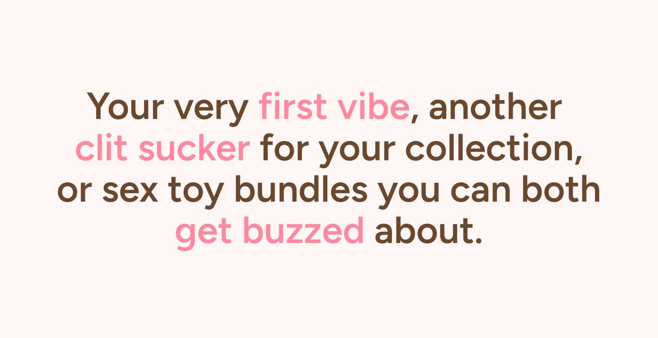
Source: Smile Makers
Let your reviews do the talking
The biggest fans are always the most willing reviewers. They’ll do anything to prove they’re part of the club—especially for brands that are wittier, wilder and more out there than most—and that means going hard on things like jokes, wordplay, or anything else that aligns with your brand voice. All of this is gold dust on the UGC front, so be sure to put reviews front and centre on product pages, and pepper the best ones throughout collections and the homepage.
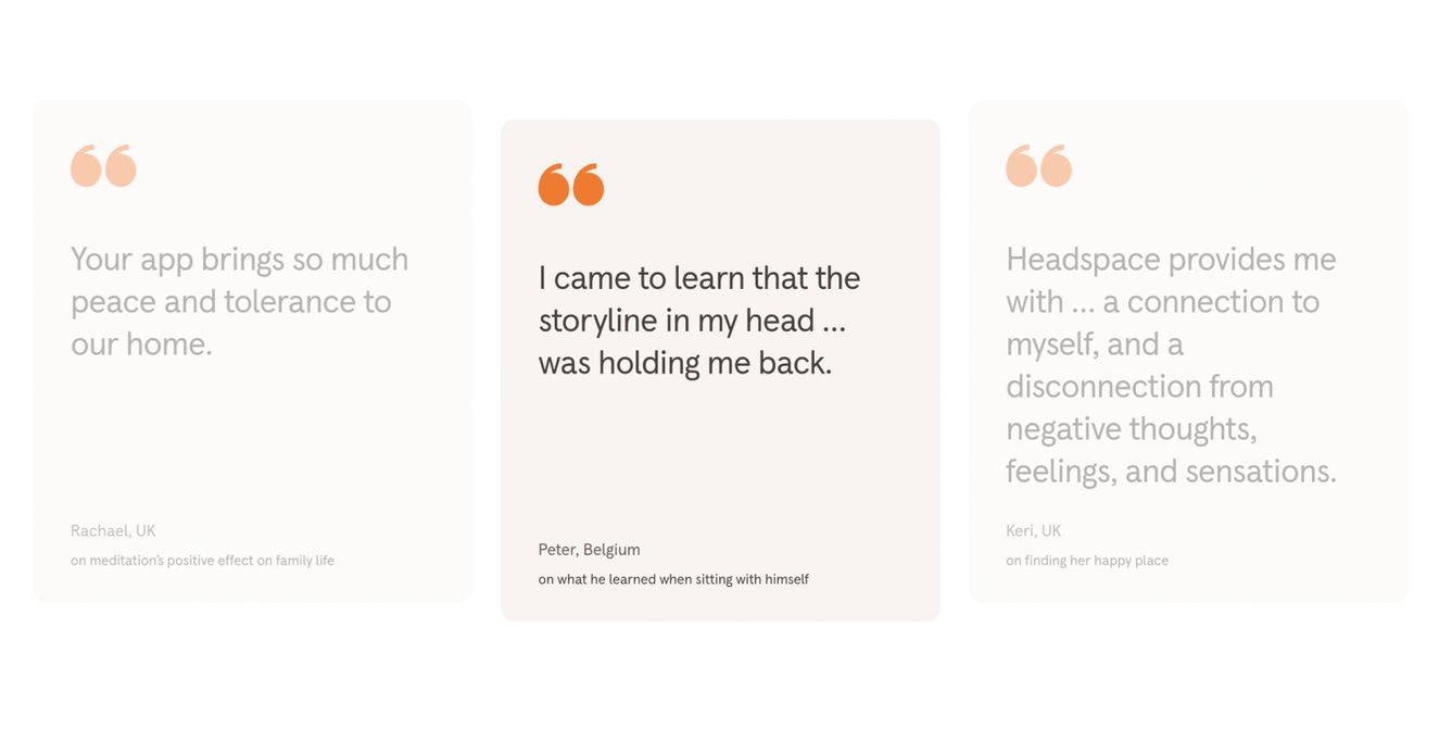
Source: Headspace
Jazz up those pop-ups and sign-ups
Pop-ups are the perfect place to go wild with copy and design. We spend our lives clicking “X” on cookie pop-ups, so give your users something they’ll actually want to engage with. Think cheeky one-liners, interactive elements or surprise discounts. Injecting a little fun into areas like this is a great way to give your users a taste of what’s to come. But—and it’s a big but—be conscious of winding up users. Some of us are still traumatised from the Windows spammy pop-up days, so it’s better to only display pop-ups based on user interaction, for example, if someone clicks ‘Sign up to our newsletter’.
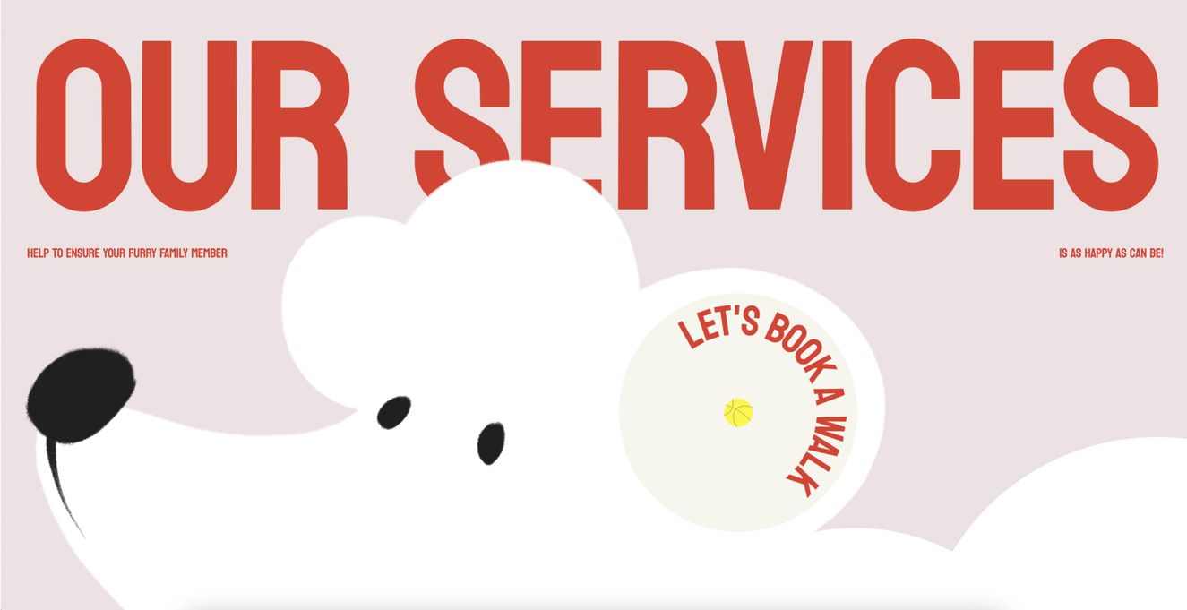
Source: Don't Board Me
Create a descriptive PDP (minus the descriptions)
Well, not the main product description—that one’s still a biggie. But think about incorporating more visual elements like rating scales, comparison charts, ‘smells like’ snippets, and rotating badges—basically, anything that helps describe your product without words. They’ll draw the eye, break up the text, and add a little comic relief while still giving the user all those useful insights.
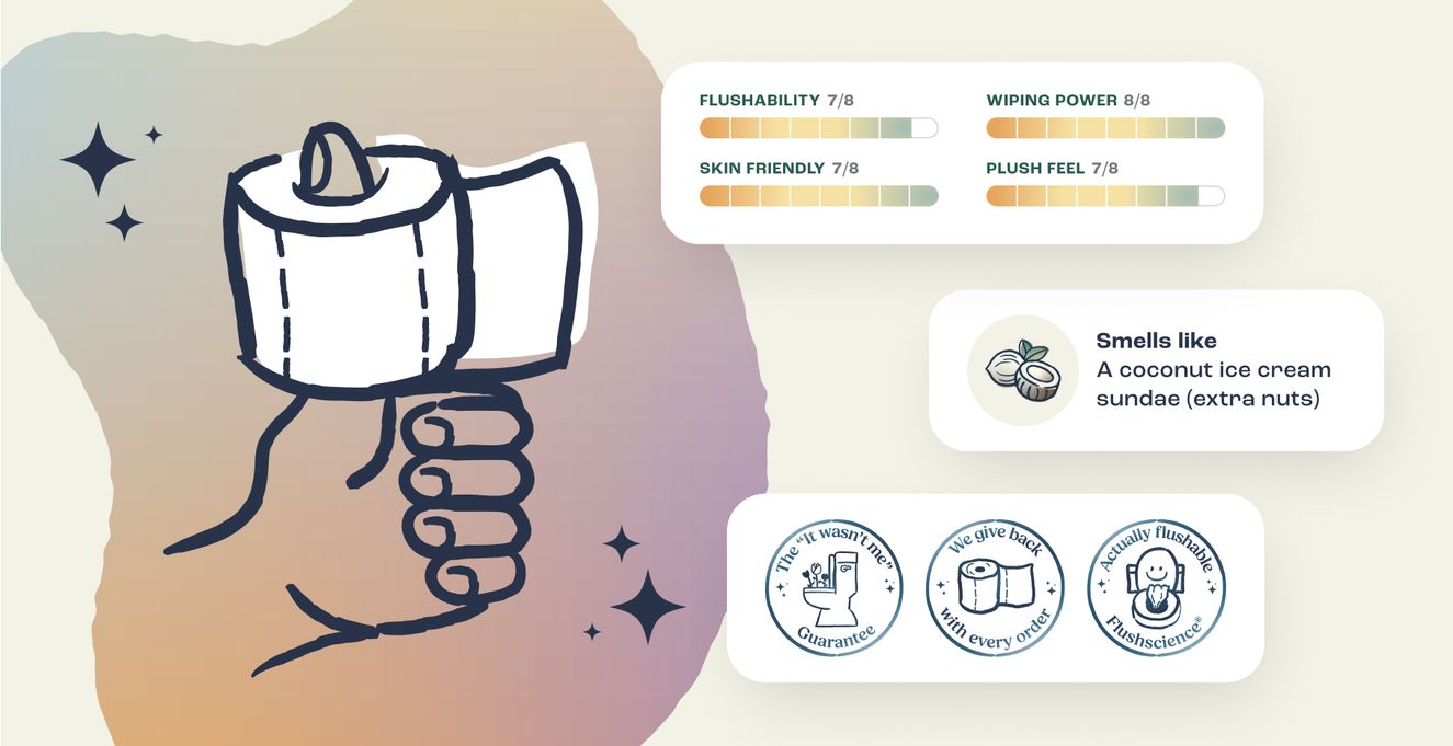
Source: Design concepts for Fanny
Make your animations bouncy and playful
Movement will naturally add more life to the site, which is great if you’re a brand with bags of character. Bouncing product renders, animated gifs, rotating banners, pulsing actions on hover—all of these can help draw attention to things like offers or shopping carts, or simply encourage your users to explore new areas of the site. But let’s not go overboard—no one likes motion sickness. Especially while online shopping.
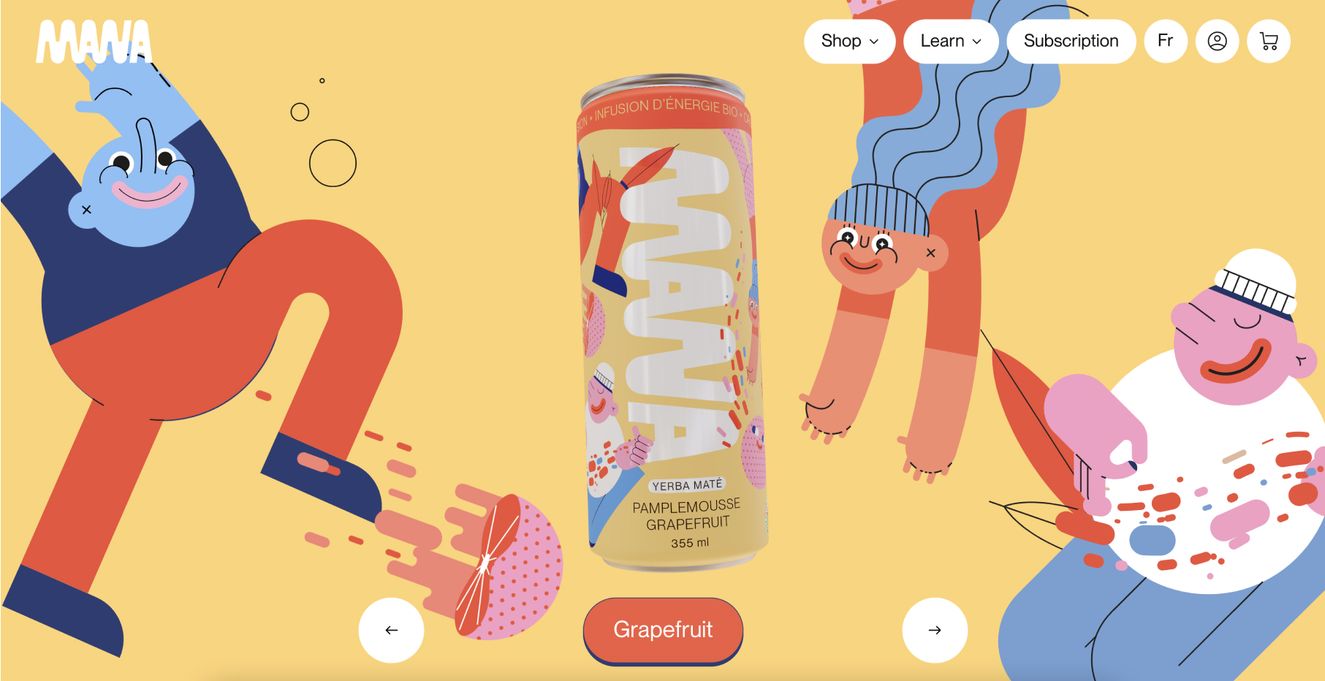
Source: MANA Yerba Maté
Add a quiz in the mix
Again, with no SEO restrictions to hold you back, this is another place where you can go wild with design and copy. The interaction element is naturally great for engagement. Plus, it’s a great way to push certain products or exclusive discounts—or even capture user information if you’re all about building that database.
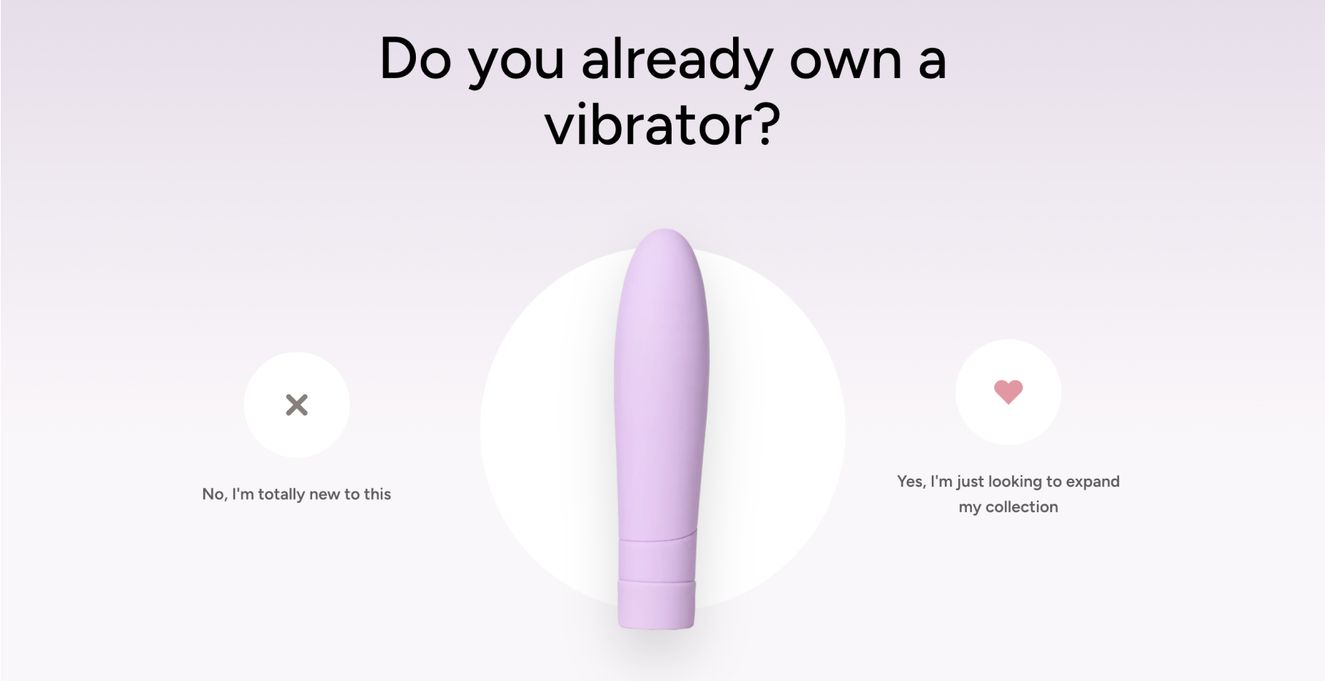
Source: Smile Makers
Don’t forget your 404
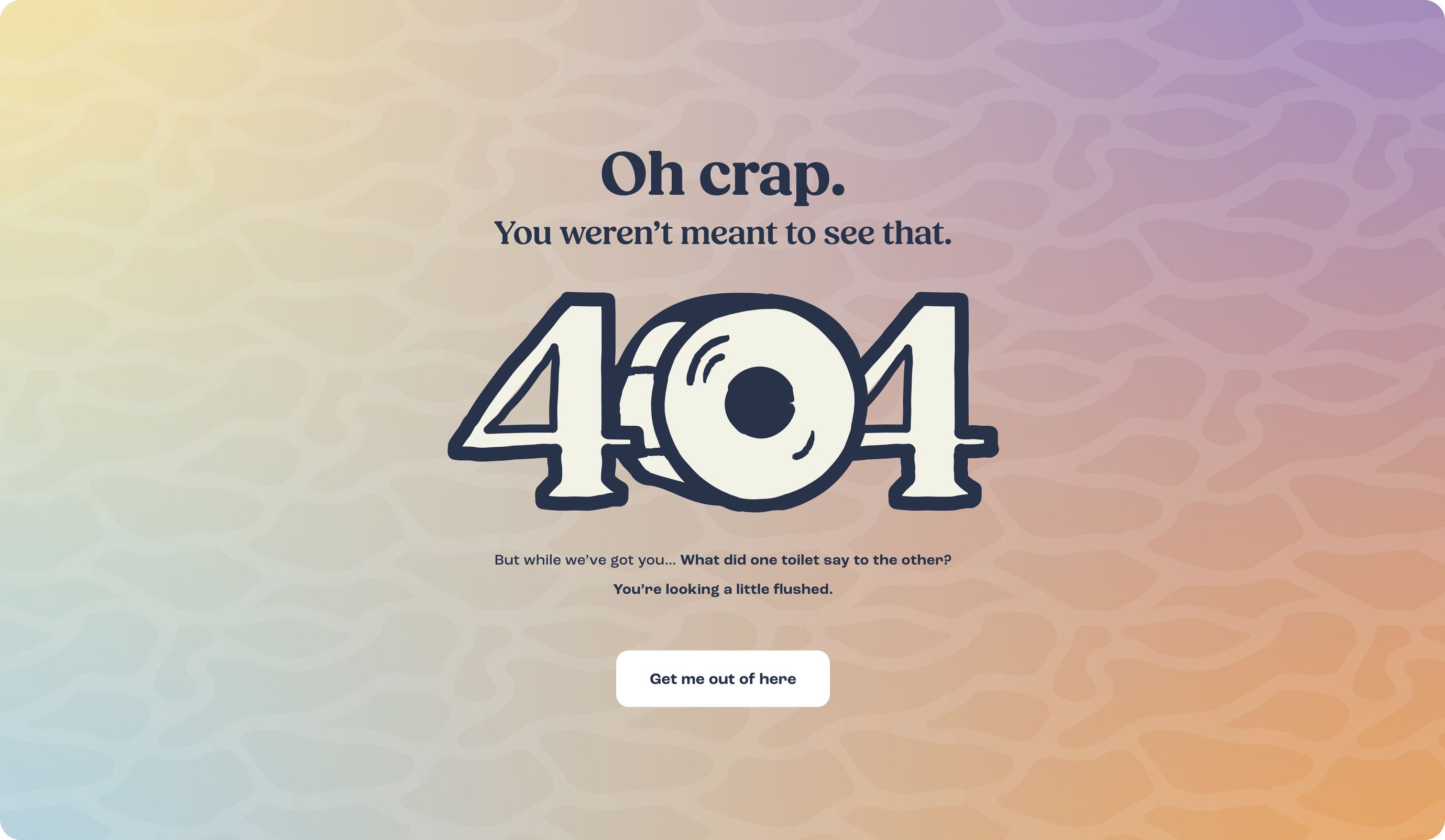
Ahhh, the original Easter eggs of the web world. The 404 page is a place that hopefully doesn’t get seen, but is something you want to surprise and delight when it does. For you, it’s a place for your most avid fans to seek out and fall in love with your brand even more. And for web designers like us, it’s a chance to really let loose as a project comes to a close.
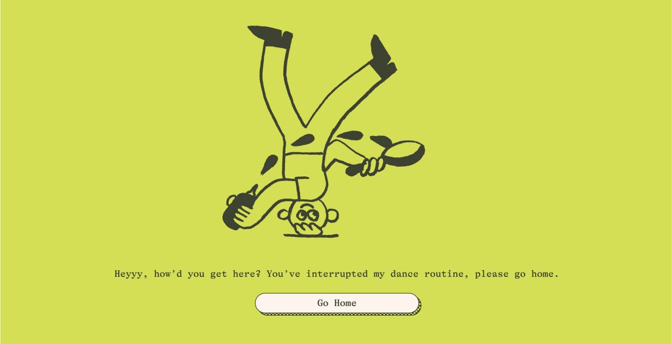
Source: Graza
There’s plenty more where that came from. Head back to the journal for more news and views from the team.


