Accessibility in design - Typography and legibility

Written by Nate


Next up in our accessibility in design series, we’re talking typography and legibility.
Our last post covered all things colour testing, from contrast to psychological connotations. And now it’s the turn of fonts, sizes, and characters to be scrutinised by the W3C’s AA accessibility standards.
Here’s how we tackle everything from accessible font styles to legibility as part of our ongoing mission to build a better internet.
What are the AA standard font sizes?
The AA accessibility standards set by the WCAG are a legal requirement in the UK and Europe. Over 2 billion people live with a disability that we need to consider when designing user interfaces – and font size is just one area we need to look at.
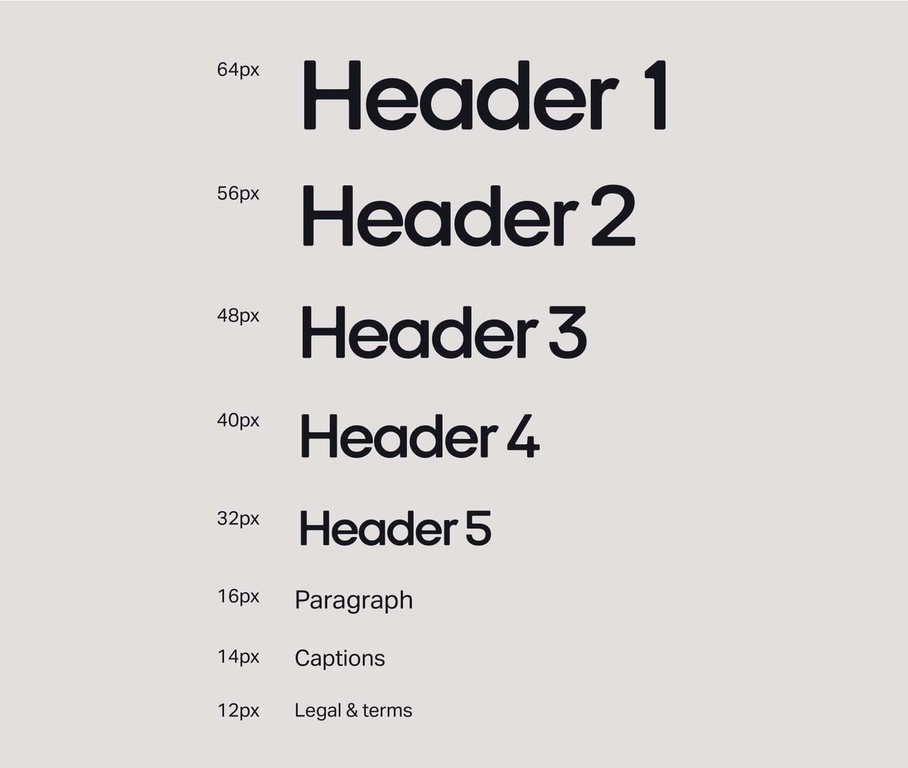
Headlines (24px+)
Your average headline is always going to be larger. Similar to a traditional eye test, the larger the font the more legible it is to the reader.
Body copy (16px)
Body copy should remain the same on mobile and desktop devices. This size is the most common across the web. Research also shows it’s the most accessible size for users to read.
Button text (16-18px)
Similar to body copy, button text should always follow the same sizing or larger.
Captions/legal stuff (12-14px)
Smaller, less important pieces of text such as legal footer terms and image captions are the only reason that font sizes should be below 14px.
Here’s how accessible font styles might look based on an 8px grid system
What is font legibility testing?
When it comes to accessibility, using the right sizes of fonts isn’t enough.
Yes, size matters – but it’s important to always do quick checks to test the legibility of the font itself. Why? Although it might sound crazy, not all typefaces are created with legibility as a primary design function. Many fonts are designed to create a typographic statement or instil a particular feeling. And some typefaces are just designed to stand out from the crowd.
Here are three key things we test for.
Imposter characters
Some typefaces have letterform designs that are virtually identical for multiple letters. Here’s the number 1, upper case “i”, symbol “|” and upper case L in Gill Sans to show you what we’re talking about.
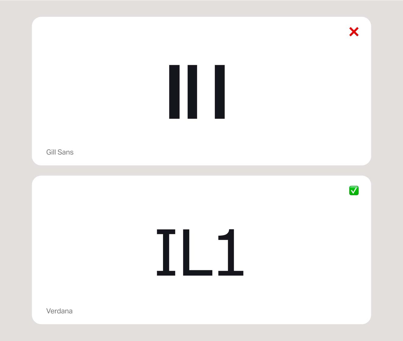
How we approach them
Try to choose a typeface or font with distinct features on both the top and/or the bottom of the capital 'L' and a short but noticeable arm on the top of the number “1”.
Character mirroring
All sighted young children horizontally flip letters as part of their early neurological development. At around six years old, this neurological trait usually resolves itself as part of ongoing physiological development. But, in extremely rare occasions, the mirroring effect may also be reintroduced following some types of brain trauma.
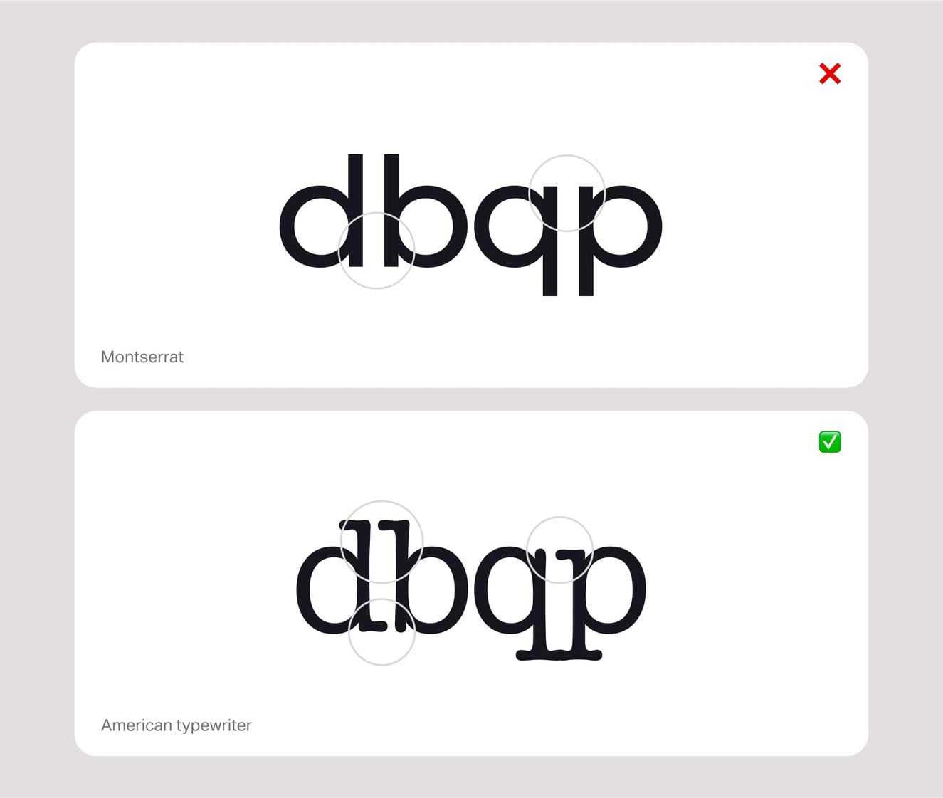
Side note
D and b, or q and p, should be obviously unique in shape and have no ambiguous characteristics. But believe it or not, as many as 90% of fonts do have similar traits, and it’s something that often isn’t considered enough in the font’s design.
Similar shapes
For those of us with more severe vision impairments, the characters o, c, e or a can be easily confused. And that, in turn, can make some words harder to identify.
If the shapes are too closed, have tight apertures, or their counters are too small, they can start looking very similar. On the flip side, more open counters within the letterforms can help emphasise the unique shape – and that means better legibility.
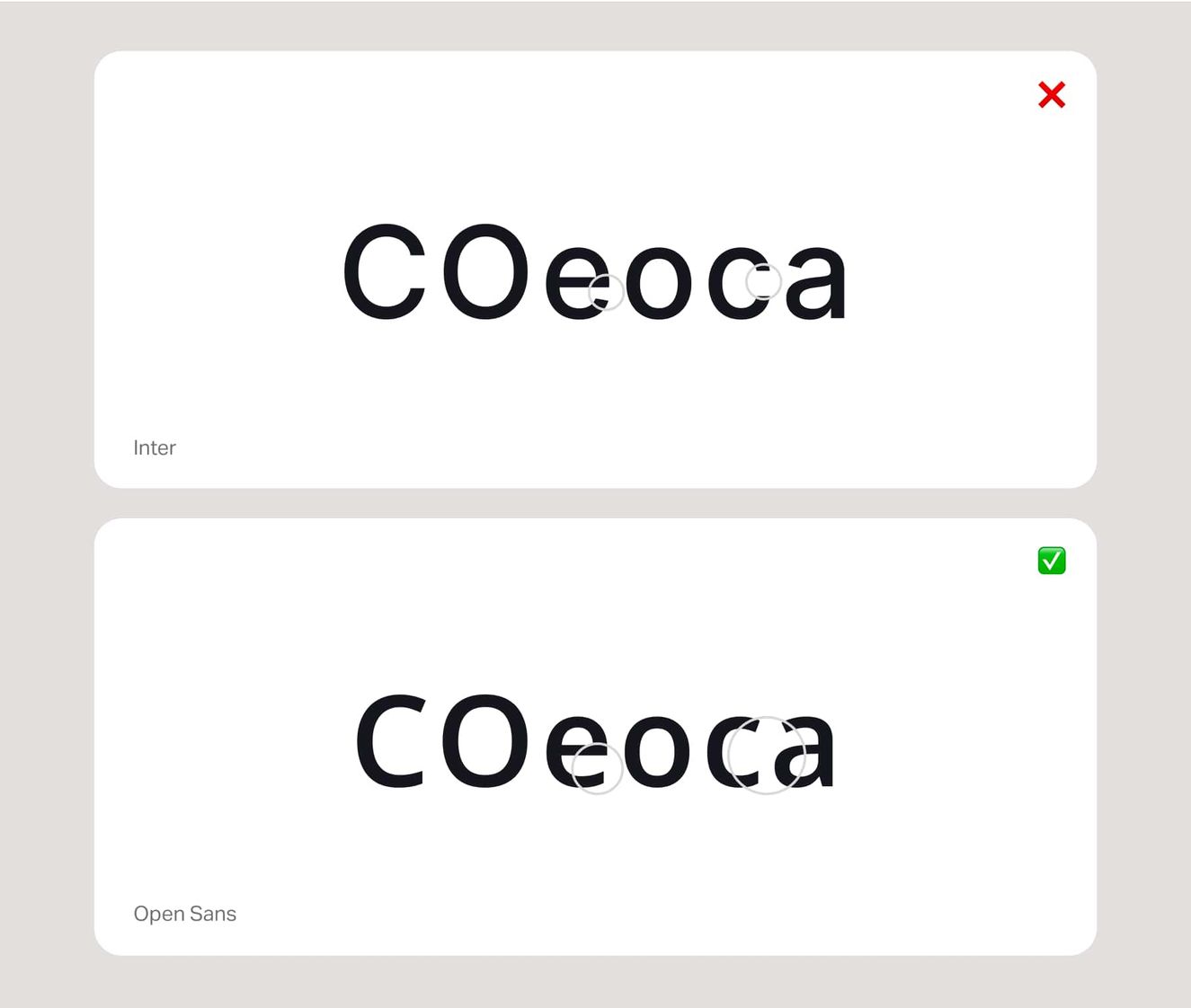
How we approach them
Similar shapes can sometimes be resolved with more letter spacing. Play around with spacing and see how it improves things.
Heights and ascenders
Like similar shapes, other elements that can impact character recognition are heights and ascenders. Check out the example of Figtree vs. Work Sans:
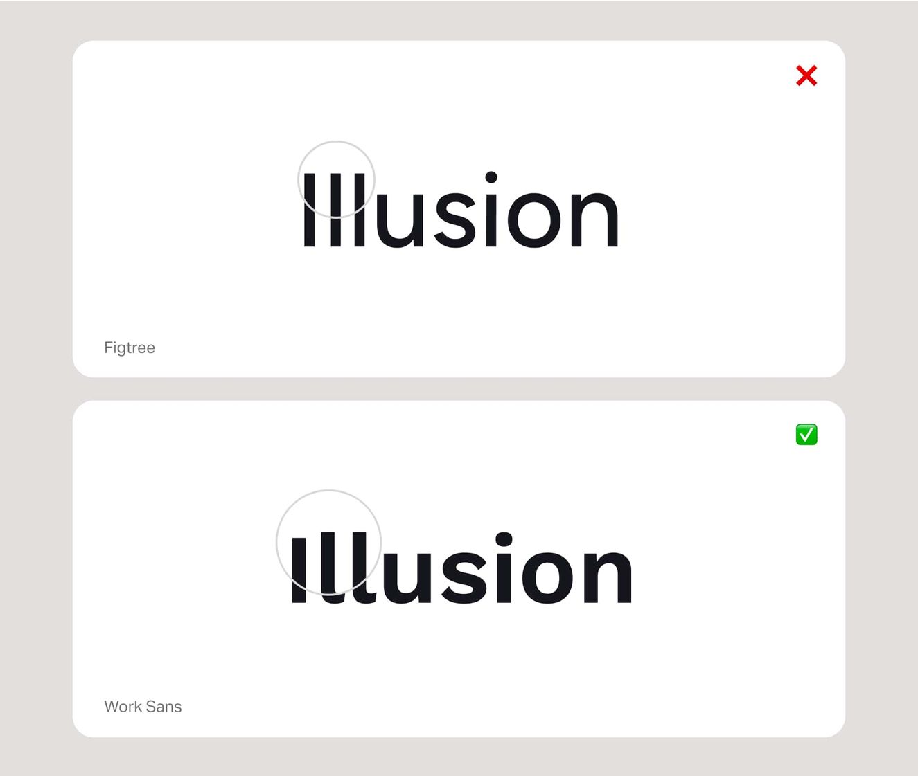
How we approach them
Raising your ascenders and incorporating other features will do wonders for legibility. As a general rule, there should be a visible difference between the capital height and ascenders.
We could talk all day about typography. But that’s a brief intro to how we make sure fonts adhere to the AA standards. Next up: UI spacing, sizing and states.