Accessibility in design - Content hierarchy

Written by Bruno


In this blog series, we’re unpacking all the vital areas of accessibility in design. It’s been a legal requirement since 2017 for websites to meet the AA criteria outlined by W3C – the global community that believes in a web for all of us – on anything.
Next up, it’s the turn of content hierarchy – something that’s super important not just from an accessibility standpoint, but for general usability, too.
Why does content hierarchy matter?
We all know how important first impressions are. But put this in the context of a user’s first interaction with your brand, and the stakes just got higher. And that just goes for those that don’t have accessibility needs.
The snap decisions that a user makes could be the difference between them trusting, buying or even engaging with you or not. And when you strip away all the other elements of your brand and are left with just the plain-text format of a screen reader, you can see why it’s so essential for your content to be structured as intelligently and logically as possible.
Capturing your user’s attention
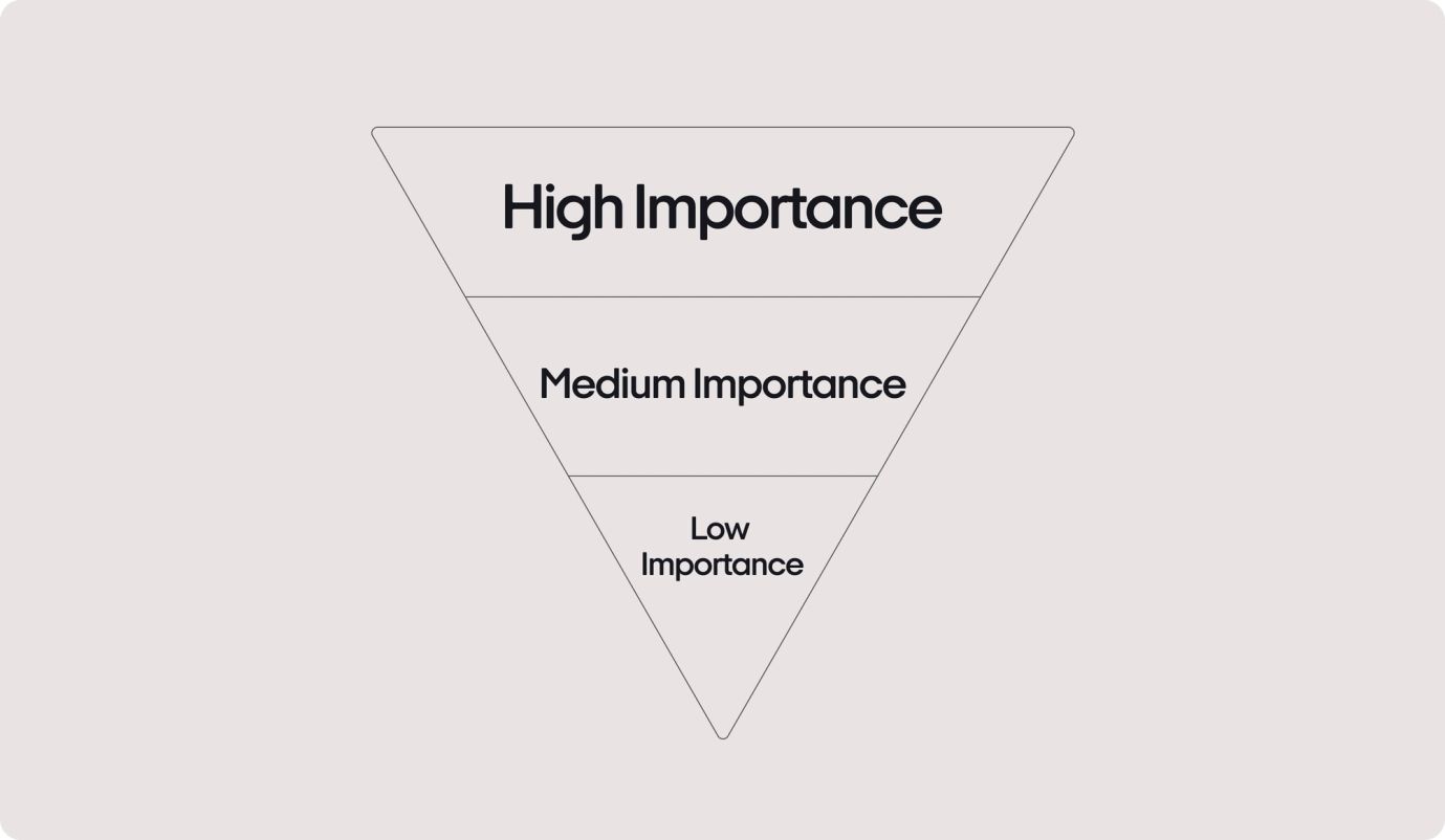
Let’s take product descriptions, for example. The goal is to draw your readers in, build trust, and encourage them to convert. Do we talk about features first? Or should we start with product names? Navigating a page with a screen reader means your content will be presented in the order it’s positioned, so it’s important to get it right.
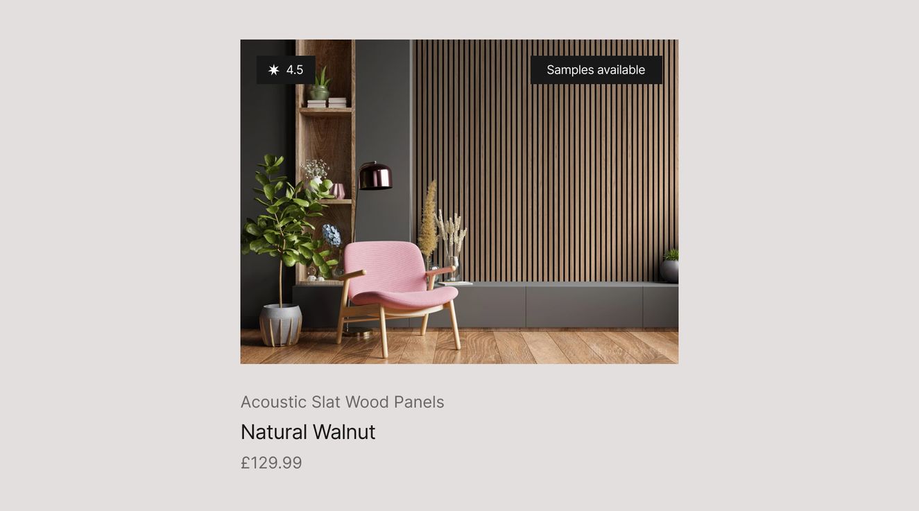
Example 1
If they’re using a screen reader, the user will see the name of the product first. This means they may not know what they’re looking at.
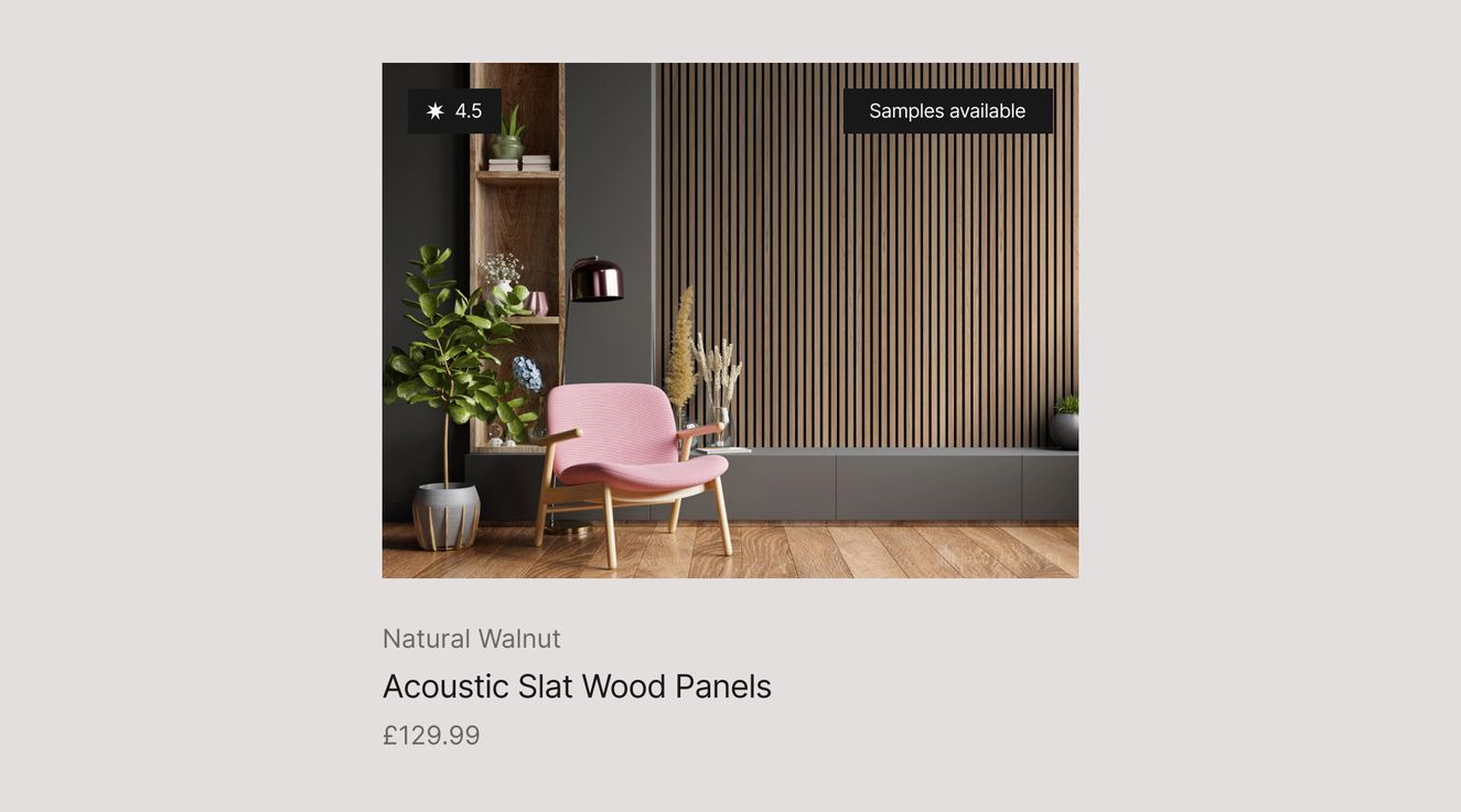
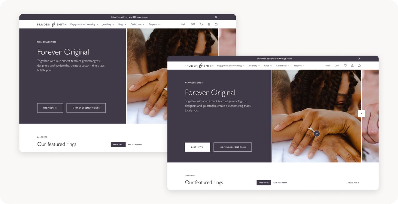
Example 2
A screen reader would tell this user what the product is before talking about its features. Visually, it feels much more desirable to non-accessible users, too.
Highlighting call to actions
Your path to purchase should be suitable for all users – both the skimmers and the in-depth readers. And the fact that this is your primary CTA should also be reflected in your content hierarchy.
But we’re not just talking preheadings, headings, and sections on the page. Your button hierarchy is important, too. Think about users that could be browsing through your site and trying to quickly find a contact or “buy” button – only to find all the CTAs look the same.
As a general rule of thumb, make sure no two CTAs in the same port follow the same styling. This makes navigating your content, and committing to a call to action, much easier for the user.
Thanks for sticking with us so far! To round off our accessibility in design series, we’ll be covering everything you need to know about motion.