3 signs that it’s time to make changes to your visual branding

Written by Nate


Your brand is your biggest asset. And your visual identity plays a key part in your business being recognised, respected and — ultimately — generating revenue. However, changes in strategy, target audience and design trends can all make your brand feel irrelevant or outdated compared to your competitors.
Here are just three signs that your visual identity could be due an upgrade.
Your look is out-of-date or uninspiring
Like everything in design, trends come and go pretty quickly. And if you’ve been living with your current logo for a few years now, chances are it's looking a bit behind the times. Just like people, brands evolve over time. So how you looked (or sounded) a few years ago might not be a true reflection of who you are now. But it’s important you resonate with your current target audience. And sometimes, that means adapting your look so you keep up with competitors.
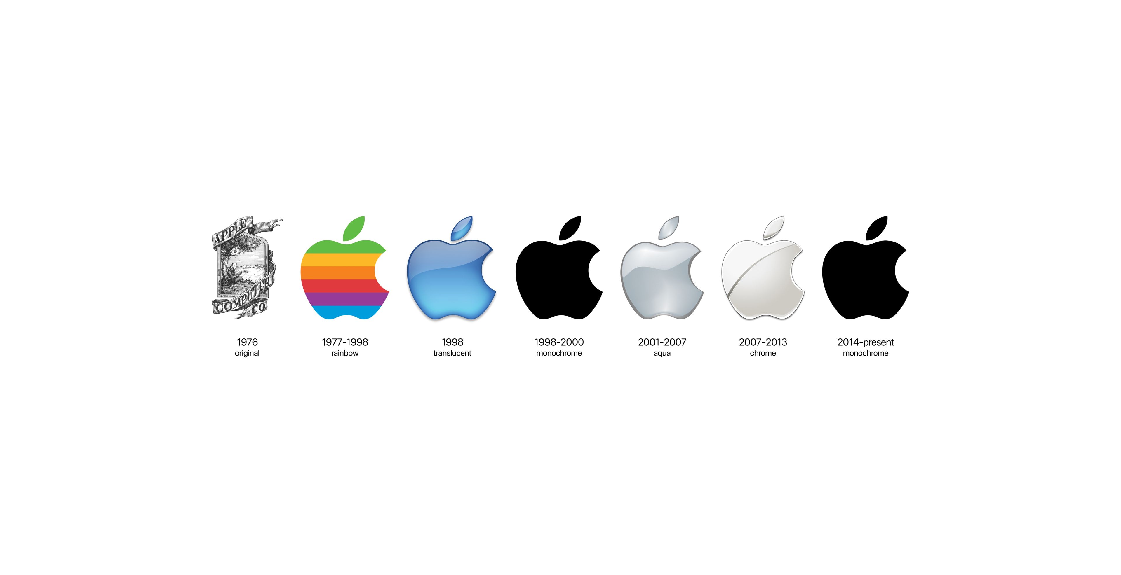
A textbook example is Apple. To be one of the world’s biggest tech giants, you need to evolve or you get left behind. Here you can see how its logo has changed over time but still remained recognisable.
Recently, we worked on refining a logo in a similar way for Acupanel. The brand’s current logo typography was uncomfortably wide, so we worked on spacing to create a more readable wordmark and clean, modern logo.
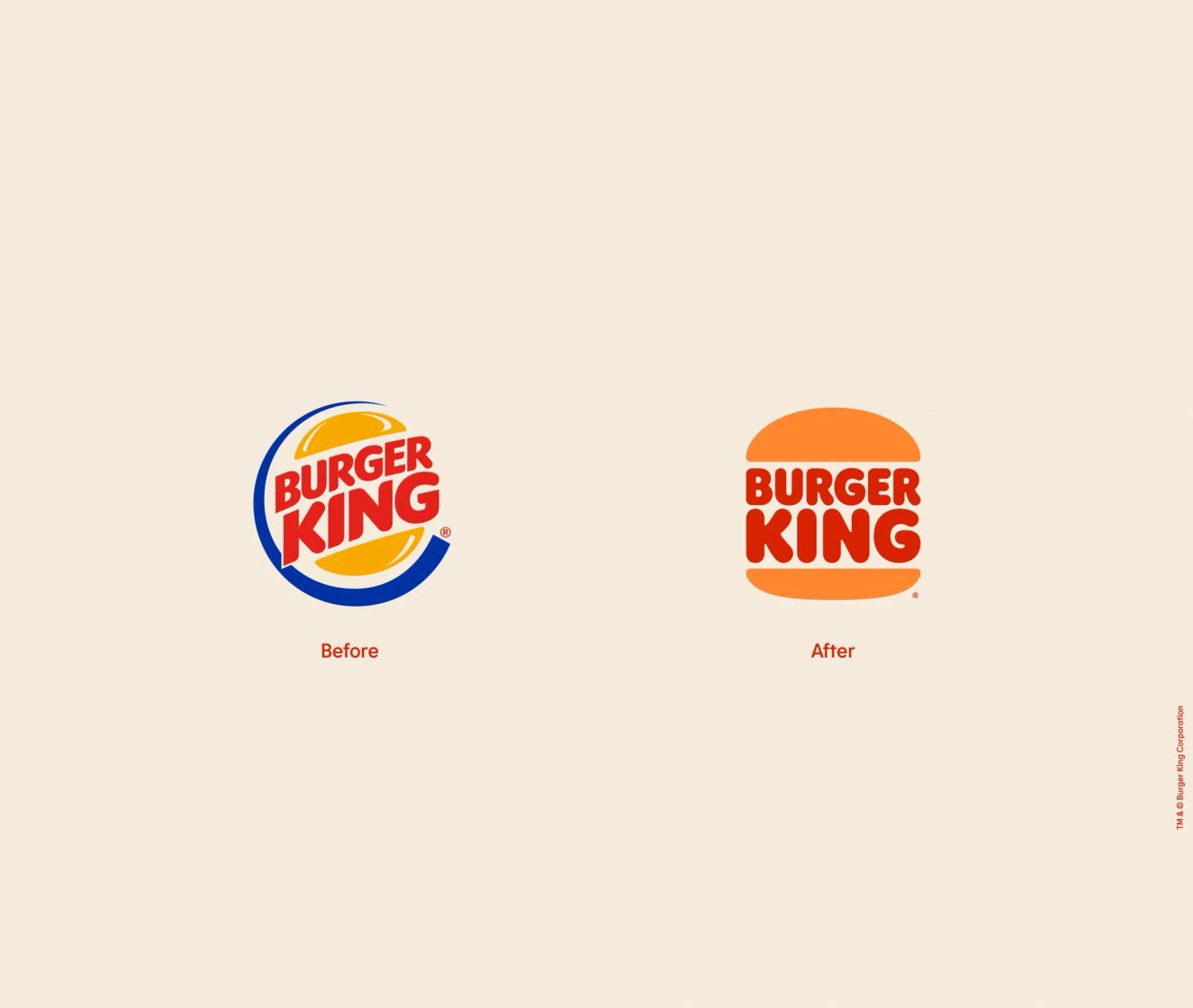
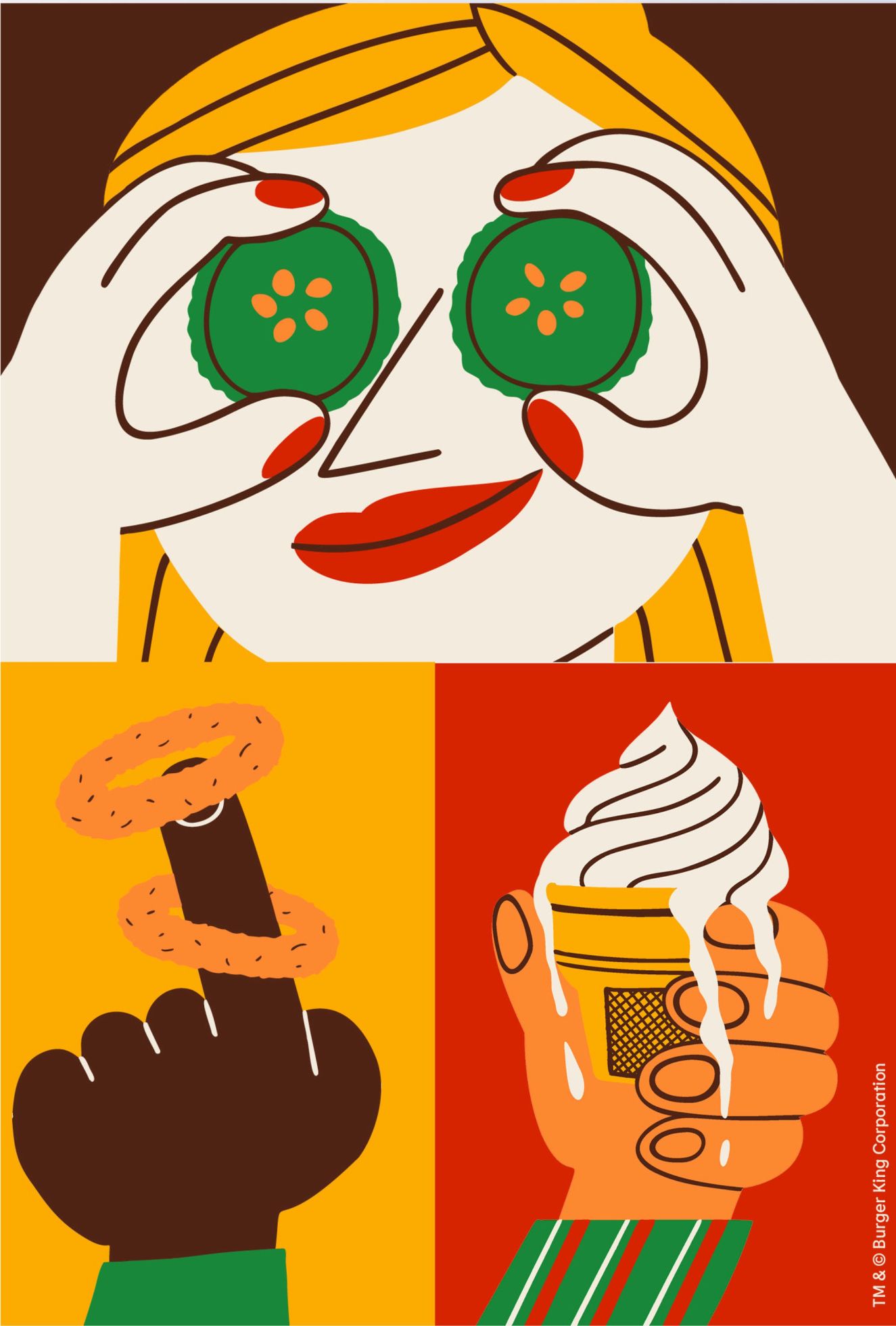
Burger King also recently showed us how the best trends go full circle. The bright blue, yellow and red logo had left the brand feeling stuck in the 90s. And so in a bold (and pretty brilliant) move, the logo first introduced in the 60s made a comeback. It gives a nod to Burger King’s heritage, but with simple, clean-cut lines and a flat, contrasting palette, it was made for the digital age.
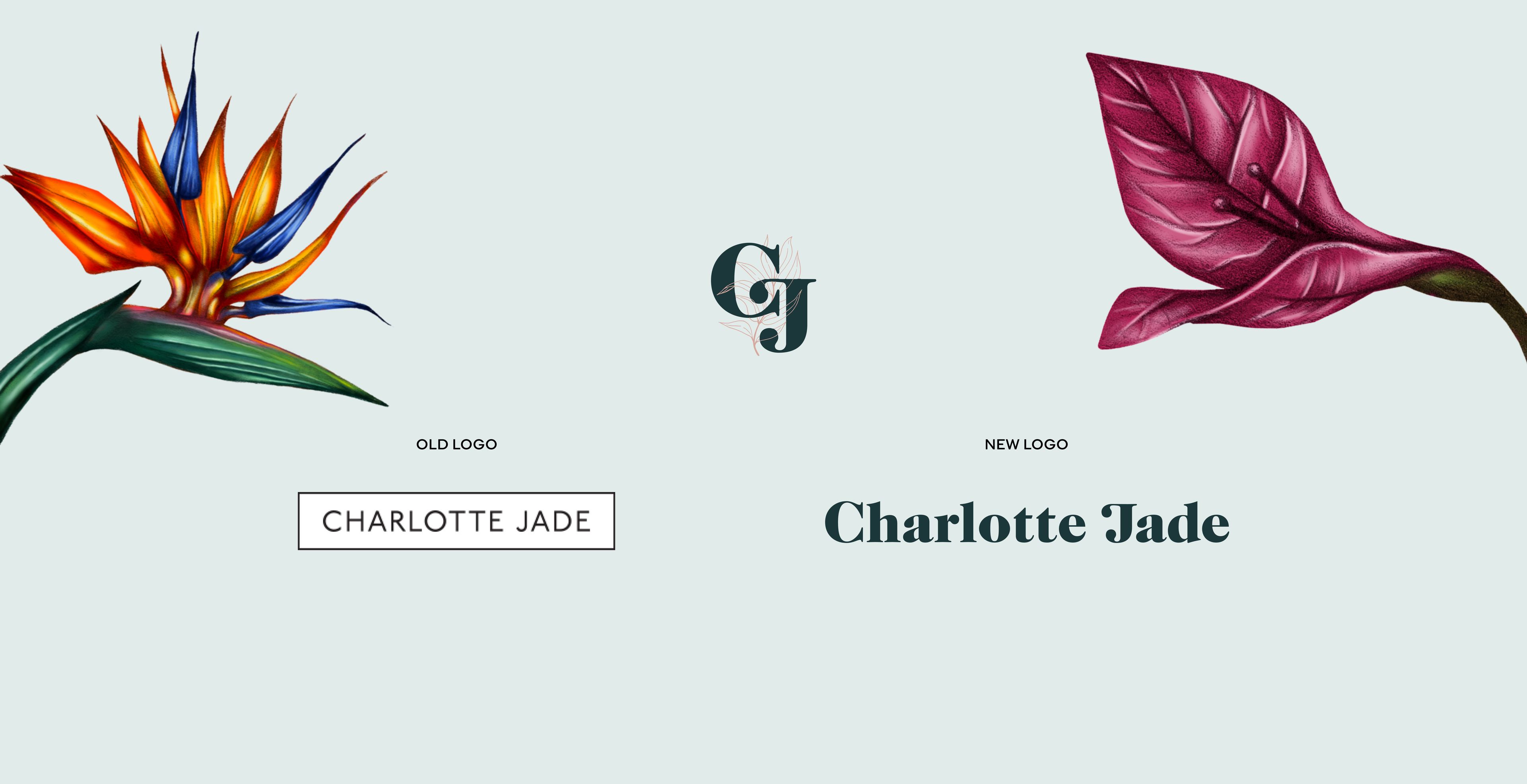
Similarly, we gave the hand-drawn wallpaper design brand, Charlotte Jade, a complete transformation. By redesigning the entire hero logo, we created something that better represents the vibrant, nature-inspired luxury interior products and artwork they create — a more recognisable brand that suits their international ambitions.
Your logo isn’t scalable
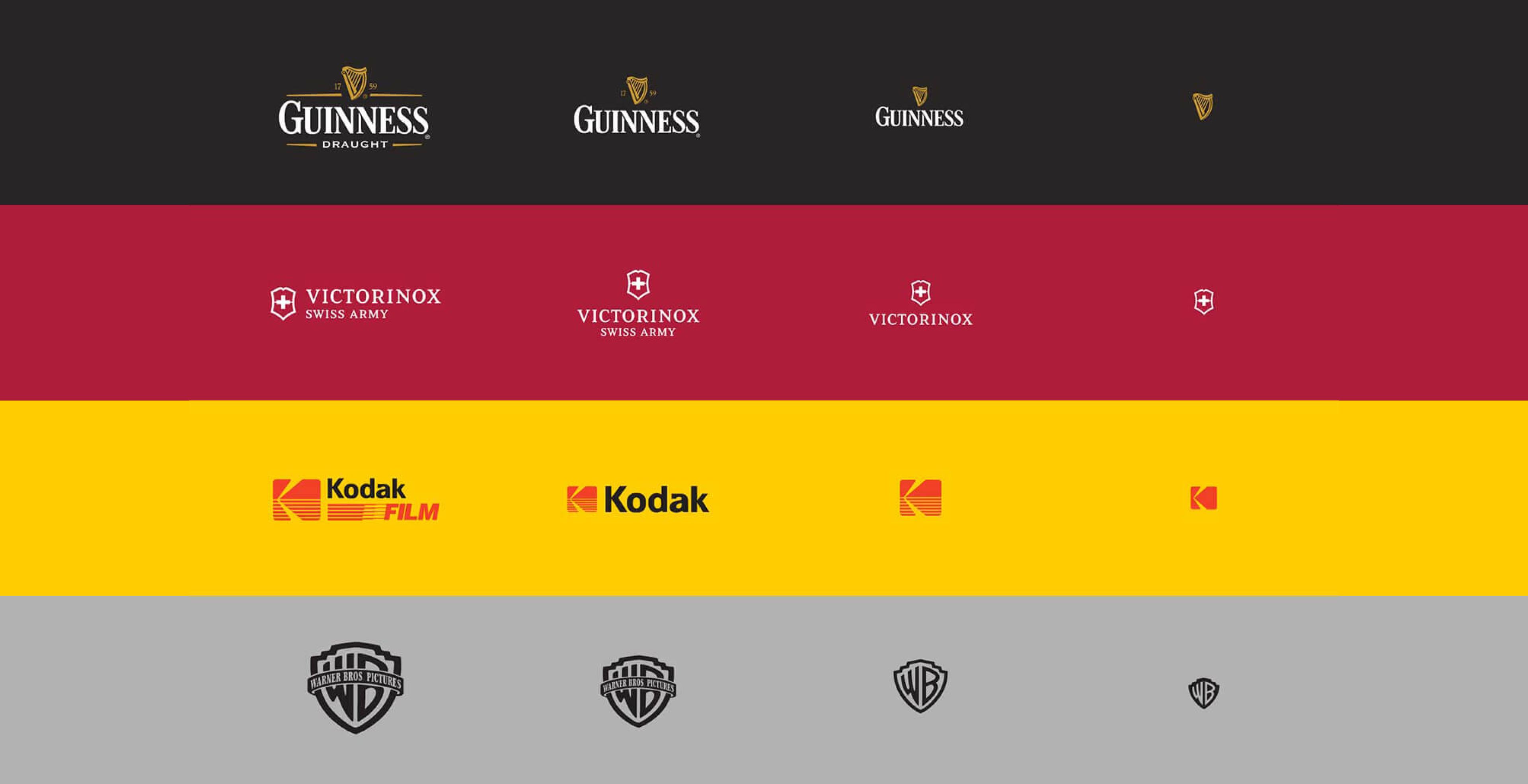
These days, accessibility is everything, so it’s important that your brand can be adaptable. Your logo sits at the centre of your brand toolkit, so it needs to be flexible enough to scale to different sizes. Is it easy to view when you shrink it down? Or do the details get lost as it becomes smaller? If your logo can’t be identified when it’s favicon size (16x16), then it’s time to switch things up.
We’re not always talking about a complete overhaul. In some cases, you’ll just need to make a few changes to things like colours, typography and logo placement. Here’s a good example of how Guinness and Kodak have transitioned their branding from full logo lockup to mini mockup.
Your brand isn’t cohesive
When it comes to building trust, consistency is king. Keeping your brand cohesive across all channels will help you become more memorable, recognisable and look more professional. So if you’re finding you don’t have a solid set of guidelines featuring everything from colours, slogans and other brand characteristics, then it’s time to invest time in creating some. Not only will it help you build more personality around your brand, but it will also save you a bunch of time when it comes to creating new assets for digital marketing materials such as emails, social posts and visuals for online and offline ads.
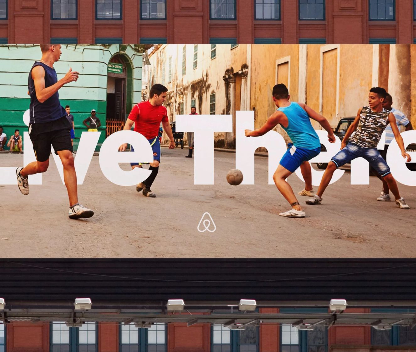
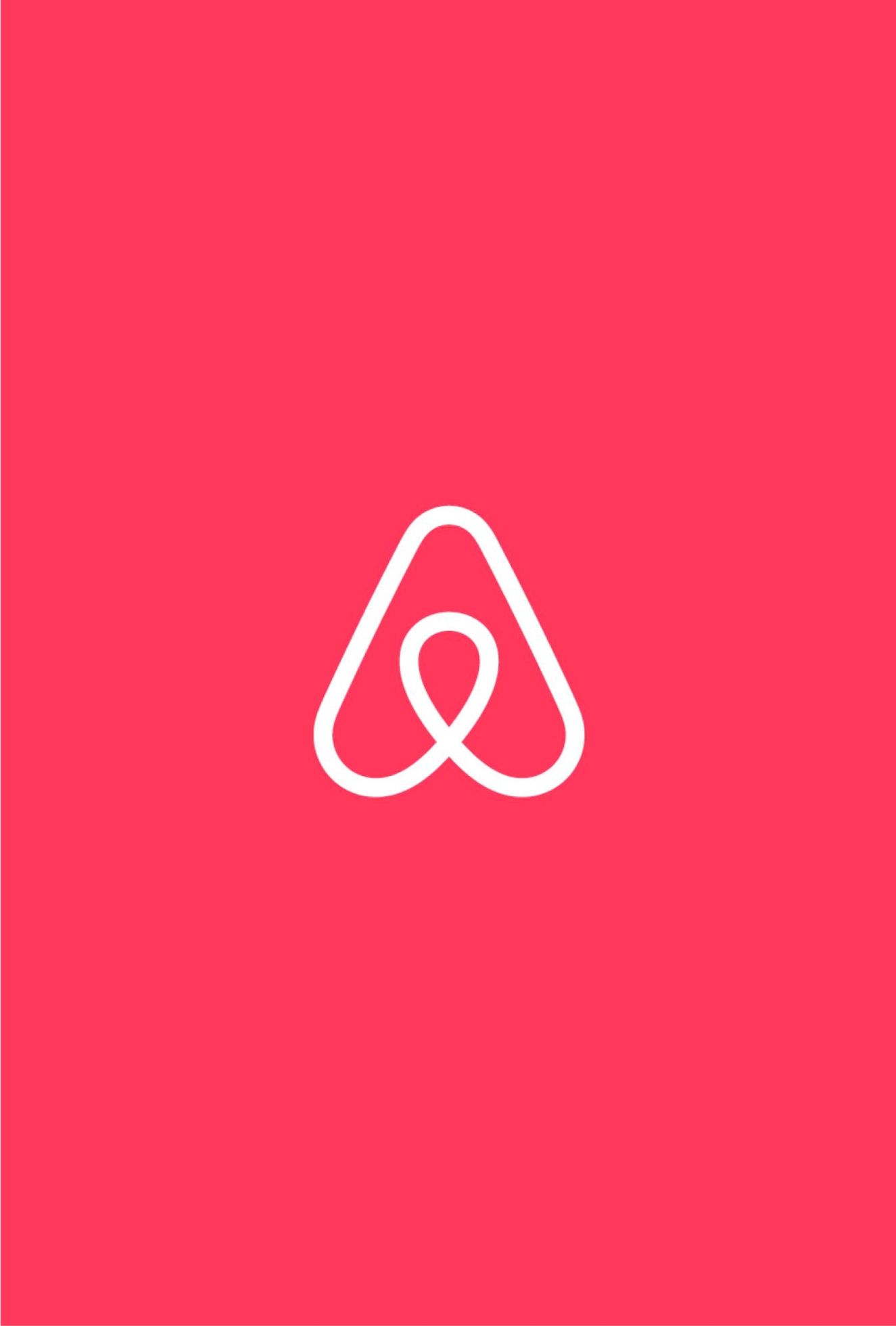
A business that’s nailed this is Airbnb. They’ve created a look and feel that’s so strong and consistent that even when you see elements such as colours, typography and tone of voice in isolation, it clearly belongs to the Airbnb brand.
Feel like change is on the horizon? Talk to us about how best to update your brand’s visual and verbal identity.